Refer to Example 2.16 on page 57. a. Explain why a frequency histogram of the DVD prices
Question:
Refer to Example 2.16 on page 57.
a. Explain why a frequency histogram of the DVD prices with single-value classes would be essentially identical to the dotplot shown in Fig. 2.7.
b. Would the dotplot and a frequency histogram be essentially identical with other than single-value classes? Explain your answer.
Refer to Example 2.16
Prices of DVD Players One of Professor Weiss’s sons wanted to add a new DVD player to his home theater system. He used the Internet to shop and went to price-watch. com. There he found 16 quotes on different brands and styles of DVD players. Table lists the prices, in dollars. Construct a dotplot for these data.
Solution We apply Procedure.
Step 1 Draw a horizontal axis that displays the possible values of the quantitative data.
See the horizontal axis in Fig.
FIGURE Dotplot for DVD-player prices in Table
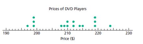
Step 2 Record each observation by placing a dot over the appropriate value on the horizontal axis.
The first price is $210, which calls for a dot over the “210” on the horizontal axis in Fig. Continuing in this manner, we get all the dots shown in Fig.
Step 3 Label the horizontal axis with the name of the variable.
The variable here is “Price,” with which we label the horizontal axis in Fig.
TABLE Prices, in dollars, of 16 DVD players
210 | 219 | 214 | 197 |
224 | 219 | 199 | 199 |
208 | 209 | 215 | 199 |
212 | 212 | 219 | 210 |
To Construct a Dotplot
Step by Step Answer:
a A single value frequency histogram for the prices of DVD players would be identical to the dotplo...View the full answer