

The graph above and to the right was created with Stat Crunch using data from the Federal
Question:
The graph above and to the right was created with Stat Crunch using data from the Federal Communication Commission website: (www.fcc.gov). The blue dots on the graph show the percentage of all households in the United States that had a landline for non-cellular telephone service for the years 2010-2017. The red line can be used to approximate this same percentage. On the graph, x = 0 represents the year 2010, x = 1 represents the year 2011, x = 2 represents the year 2012, and so on.
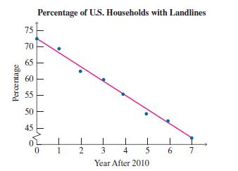
a) Use the points 10, 72.52 and 17, 43.82 to calculate the slope of the red line.
b) Determine the equation of the red line.
c) Using the equation you determined in part (b), estimate the percentage in 2016.
d) Using the equation you determined in part (b), determine the year in which the percentage was 60.2.
Step by Step Answer:
a m 438 7257 0 41 ...View the full answer


A Survey Of Mathematics With Applications
ISBN: 9780135740460
11th Edition
Authors: Allen R. Angel, Christine D. Abbott, Dennis Runde
