

For this problem we will use the data in the file Global100 that was referenced in Section
Question:
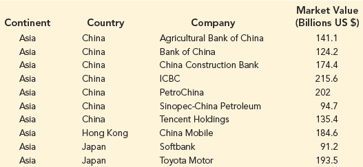
Use Excel to create a GIS chart that
1) displays the Market Value of companies in different countries as a heat map;
2) Allows you to filter the results so that you can choose to add and remove specific continents in your GIS chart; and
3) uses text labels to display which companies are located in each country. To do this you will need to create a 3D Map in Excel. You will then need to click the Change the visualization to Region button, and then add Country to the Location box (and remove Continent from the Location box if it appears there), add Continent to the Filters box and add Market Value (Billions US $) to the Value box. Under Layer Options, you will also need to Customize the Data Card to include Company as a Field for the Custom Tooltip.
a. Display the results of the GIS chart for companies in Europe only. Which country in Europe has the highest total Market Value for Global 100 companies in that country? What is the total market value for Global 100 companies in that country?
b. Add North America in addition to Europe for continents to be displayed. How does the heat map for Europe change? Why does it change in this way?
Step by Step Answer:
a The United Kingdom has the highest total market value for Global 100 companies The Global 100 comp...View the full answer


Essentials Of Business Analytics
ISBN: 9781337406420
3rd Edition
Authors: Jeffrey D. Camm, James J. Cochran, Michael J. Fry, Jeffrey W. Ohlmann, David R. Anderson, Dennis J. Sweeney, Thomas A. Williams
