

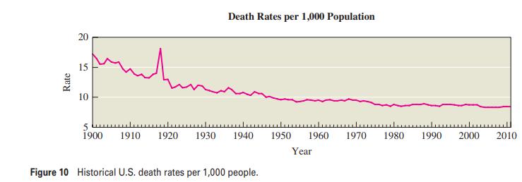
Figure 10 shows a time-series graph for the death rate (deaths per 1,000 people) in the United
Question:
Figure 10 shows a time-series graph for the death rate (deaths per 1,000 people) in the United States since 1900. (For example, the 1905 death rate of 16 means that, for each 1,000 people living at the beginning of 1905, 16 people died during the year.) Discuss the general trend. Also consider the spike in 1918: If someone told you that this spike was due to battlefield deaths in World War I, would you believe it? Explain.
Fantastic news! We've Found the answer you've been seeking!
Step by Step Answer:
The general trend in death rates is clearly downward presumably bec...View the full answer

Answered By
Branice Buyengo Ajevi
I have been teaching for the last 5 years which has strengthened my interaction with students of different level.
1+ Reviews
10+ Question Solved
Related Book For 
Statistical Reasoning For Everyday Life
ISBN: 9780321904645
4th International Edition
Authors: Jeffrey Bennett, William L. Briggs, Mario F. Triola
Question Posted:
