Assume you are working for Apple and are summarizing key sales data for presentation to an external
Question:
Assume you are working for Apple and are summarizing key sales data for presentation to an external audience, such as potential investors or media reporters. You would like to create charts to quickly summarize your performance and allow others to compare your performance across operating segments and product lines.
Use the two tables below to create the following charts. Remember to follow effective design principles.
A. Create a line chart to show net sales growth from 2014 to 2018.
B. Create a line chart to show unit sales of the top four product groups from 2014 to 2018.
C. Create a bar chart to show net sales for the five product groups in 2018.
D. Create a pie chart to show net sales for the product groups in 2018.
E. Create a bar chart to show unit sales by operating segments in 2018.
F. Identify two key relationships or comparisons from the table.
Create charts that best illustrate these relationships or comparisons.
G. As directed by your instructor, exchange your charts with a partner from your class. Evaluate one another’s chart designs in terms of title descriptiveness, focal points, information sufficiency, ease of processing, and takeaway message.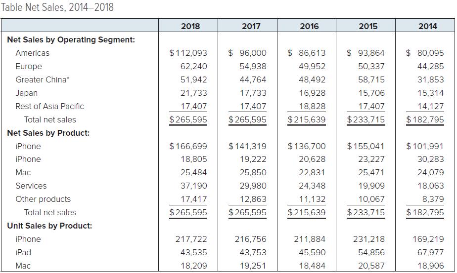
Step by Step Answer: