

1. The timeplot in Figure 9 shows the price at the end of the month of one...
Question:
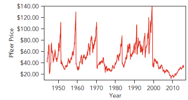
What seems to be happening? How could you verify your answer?
2. Figure 10 tracks the value of an initial +100 investment made in Pfizer in 1944. For each month, the value given is the amount invested in Pfizer at the end of the previous month multiplied by the percentage change during the month. The value of the initial $100 investment is approaching $3 million.
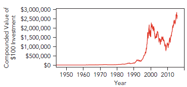
a. What does the White Space Rule say about this figure?
b. Would it be appropriate to summarize these data using a histogram?
3. Figure 11 shows the timeplot of month-to month percentage changes in the value of Pfizer, adjusting for dividend payments and stock splits. Would it be appropriate to summarize these data using a histogram?
4. Explain in your own words how it is that the percentage changes (Figure 11) look so random, whereas the cumulative value of investing in Pfizer (Figure 10) grows so smoothly until the last 20 years.
5. a. Describe the distribution of percentage changes in the value of Pfizer stock and find the mean and standard deviation.
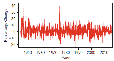
b. Using the mean and standard deviation, how might you estimate the chance that stock in Pfizer would fall 6% or more next month? How does this compare to the fraction of times that the stock fell by 6% or more in the data?
c. If we invest +1,000 in Pfizer for one month, what is the Value at Risk based on the Empirical Rule? Interpret the VaR in your own words.
STOCK PRICES
At the end of the 20th century, Enron was one of the world€™s largest corporations. It began in 1986 as a regional supplier of natural gas and grew into a dominant player in the energy trading business. All of that came to an end when it abruptly collapsed in 2001. The price of a share of stock in Enron mirrors the spectacular rise and fall of the company. In April 1986, each of the 45 million shares of stock in the newly formed Enron Corporation sold for +37.50. By the end of 2000, there were 740 million shares valued at +80 apiece. At that point, Enron€™s market value was +60 billion. Had you bought and held one of those first shares that cost +37.50, it would have grown into eight shares worth +650 by the end of 2000. Not bad. To match that, you€™d need a savings account that paid 21% interest each year!
Timing in the stock market, however, is important. Had you held onto that stock in Enron a little longer, it would have been worth less than 650 cents! The price collapsed to +0.26 a share by the end of 2001.
Were there hints of trouble before the bottom dropped out? Books that describe Enron€™s wheeling and dealing, such as The Smartest Guys in the Room (written by two reporters from Fortune magazine), convey the impression that a lot of people should have known something was going to happen. But what about regular investors? Could they have recognized the risks of investing in Enron? Let€™s see how investors could have used statistics to appreciate the risks in owning stock in Enron.
Stock Prices
To measure the risk of owning a stock, we start with data that record the price of one share. The data in this analysis record the price of Enron stock at the end of each month from April 1986 through December 2001. These prices form a time series. Each row in the data table refers to a specific month, and the variable Price records the price of one share of Enron stock at the end of the month. The rows are in order, so that running down the column of prices tracks Enron€™s history. Table 1 lists the first four months of data.
Date ................................... Price
April 1986 ...................... $37.50
May 1986 ...................... $41.38
June 1986 ...................... $44.00
July 1986 ....................... $40.00
‹® ............................................ ‹®
We begin our analysis as usual: with a plot. We€™ve only got one time series and the dates, but we€™ll begin with a scatterplot. How are we going to build a scatterplot from one column of numbers? Easy. The time order defines the x-axis for the scatterplot, and the prices define the y axis forming the timeplot (Chapter 1) shown in Figure 1.
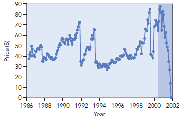
The timeplot begins in April 1986 when Enron sold for $37.50 per share. The price bounces around after that. Several times it runs up only to fall suddenly. Up until the end, the price recovered after each fall.
Once we€™ve seen Figure 1, it€™s possible to wonder why anyone would be surprised by the collapse of Enron. The price of a share fell 50% three times in the 1990s, and it steadily recovered after the first two. Perhaps the drop at the end of 1999 was the time to buy shares while the price was low, hoping for another steady recovery. That might seem like a risky bet. Wasn€™t it inevitable that one of those drops would be deadly?
CorporationA Corporation is a legal form of business that is separate from its owner. In other words, a corporation is a business or organization formed by a group of people, and its right and liabilities separate from those of the individuals involved. It may... Distribution
The word "distribution" has several meanings in the financial world, most of them pertaining to the payment of assets from a fund, account, or individual security to an investor or beneficiary. Retirement account distributions are among the most... Dividend
A dividend is a distribution of a portion of company’s earnings, decided and managed by the company’s board of directors, and paid to the shareholders. Dividends are given on the shares. It is a token reward paid to the shareholders for their...
Step by Step Answer:
1 Stock splits occur at the sudden drops You could verify this by finding out t...View the full answer


Statistics For Business Decision Making And Analysis
ISBN: 9780134497167
3rd Edition
Authors: Robert A. Stine, Dean Foster
