

The graph shows the amount of air pollution removed by trees in the Chicago urban region for
Question:
The graph shows the amount of air pollution removed by trees in the Chicago urban region for each month of the year. From the graph we see, for example, that the ozone level starting in May increases up to June, and then abruptly decreases.
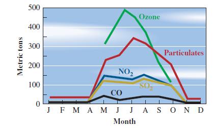
a. Are these curves the graphs of functions?
b. Look at the graph for particulates. Where is the function increasing? Decreasing? Constant?
c. On what intervals do all four lower graphs indicate that the corresponding functions are constant? Why do you think the functions are constant on those intervals?
Fantastic news! We've Found the answer you've been seeking!
Step by Step Answer:
a Yes the curves on the graph can be considered as the graphs of functions Each curve represents the amount of air pollution removed by trees in the C...View the full answer

Answered By
Faith Chebet
In the past two years many of my students have excell with the knowledge I taught them.
0 Reviews
10+ Question Solved
Related Book For 

Calculus With Applications
ISBN: 9780321831101
10th Edition
Authors: Margaret L Lial, Raymond N Greenwell, Nathan P Ritchey
Question Posted:
