

The bar graph shows the average age at which men in the United States married for the
Question:
The bar graph shows the average age at which men in the United States married for the first time from 2009 through 2013. The data are displayed as five points in a scatter plot. Also shown is a line that passes through or near the points.
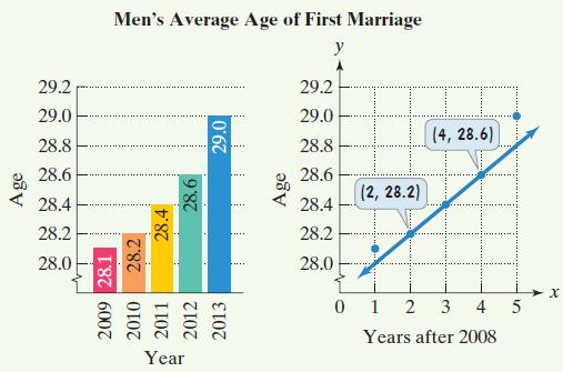 a. Use the two points whose coordinates are shown by the voice balloons to find the point-slope form of the equation of the line that models men’s average age of first marriage, y, x years after 2008.
b. Write the equation from part (a) in slope-intercept form. Use function notation.
c. If trends shown from 2009 through 2013 continue, use the linear function to project men’s average age of first marriage in 2020.
Fantastic news! We've Found the answer you've been seeking!
Step by Step Answer:
a b c The linear function predicts mens ave...View the full answer

Answered By
Payal Mittal
I specialize in finance and accounts.You can ask any question related to til undergradution.Organizational behaviour and HRM are my favourites for you can always relate to them and is an art with practical knowledge base.
226+ Reviews
778+ Question Solved
Related Book For 

Question Posted:
