

The graph shows per capita consumption of potatoes (in pounds) in the United States from 2008 to
Question:
The graph shows per capita consumption of potatoes (in pounds) in the United States from 2008 to 2016.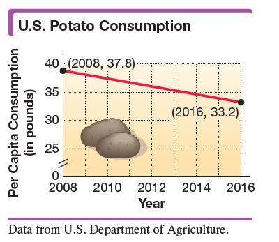
Use the given ordered pairs to find and interpret the average rate of change in per capita potato consumption per year to the nearest tenth during this period.
Fantastic news! We've Found the answer you've been seeking!
Step by Step Answer:
To find the average rate of change in per capita potat...View the full answer

Answered By
Joshua Marie Geuvara
I am an academic writer with over 5 years of experience. I write term papers, essays, dissertations, reports, and any other academic paper. My main objective is to produce a high-quality paper free from plagiarism and ensure a student scores an A+. Being a fluent English speaker, I have great communication skills that also enable me to produce excellent papers.
I am conversant with most academic referencing styles (APA, MLA, and Harvard).
You can trust me with your paper and expect nothing less than quality and excellent results. I look forward to meeting with you and, more importantly, developing something that will both make us happy and satisfied.
0 Reviews
10+ Question Solved
Related Book For 

Intermediate Algebra
ISBN: 9780134895987
13th Edition
Authors: Margaret Lial, John Hornsby, Terry McGinnis
Question Posted:
