

The graph below shows a basic demand and supply graph for home care services. Identify the equilibrium
Question:
The graph below shows a basic demand and supply graph for home care services. Identify the equilibrium price and quantity. Label them P* and Q*.
a. Retirements drive up the wages of home care workers. How would the graph change? How would P* and Q* change?
b. Improved technology lets home care workers monitor use of medications without going to clients’ homes. How would the graph change? How would P* and Q* change?
c. The number of people needing home care services increases. How would the graph change? How would P* and Q* change?
d. A change in Medicare rules expands coverage for home care services. How would the graph change? How would P* and Q* change?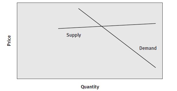
Fantastic news! We've Found the answer you've been seeking!
Step by Step Answer:
Price and quantity equilibrium The price at which the quantity of home care services supplied by producers Qs and the quantity sought by consumers Qd ...View the full answer

Answered By
Asim farooq
I have done MS finance and expertise in the field of Accounting, finance, cost accounting, security analysis and portfolio management and management, MS office is at my fingertips, I want my client to take advantage of my practical knowledge. I have been mentoring my client on a freelancer website from last two years, Currently I am working in Telecom company as a financial analyst and before that working as an accountant with Pepsi for one year. I also join a nonprofit organization as a finance assistant to my job duties are making payment to client after tax calculation, I have started my professional career from teaching I was teaching to a master's level student for two years in the evening.
My Expert Service
Financial accounting, Financial management, Cost accounting, Human resource management, Business communication and report writing. Financial accounting : • Journal entries • Financial statements including balance sheet, Profit & Loss account, Cash flow statement • Adjustment entries • Ratio analysis • Accounting concepts • Single entry accounting • Double entry accounting • Bills of exchange • Bank reconciliation statements Cost accounting : • Budgeting • Job order costing • Process costing • Cost of goods sold Financial management : • Capital budgeting • Net Present Value (NPV) • Internal Rate of Return (IRR) • Payback period • Discounted cash flows • Financial analysis • Capital assets pricing model • Simple interest, Compound interest & annuities
65+ Reviews
86+ Question Solved
Related Book For 
Question Posted:
