

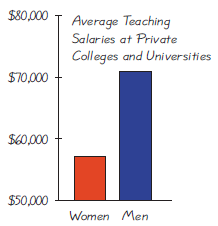
See the accompanying graph that compares teaching salaries of women and men at private colleges and universities
Question:
See the accompanying graph that compares teaching salaries of women and men at private colleges and universities (based on data from the U.S. Department of Education). What impression does the graph create? Does the graph depict the data fairly? If not, construct a graph that depicts the data fairly.
Fantastic news! We've Found the answer you've been seeking!
Step by Step Answer:
The given graph depicts the average teaching salar...View the full answer

Answered By
Pushpinder Singh
Currently, I am PhD scholar with Indian Statistical problem, working in applied statistics and real life data problems. I have done several projects in Statistics especially Time Series data analysis, Regression Techniques.
I am Master in Statistics from Indian Institute of Technology, Kanpur.
I have been teaching students for various University entrance exams and passing grades in Graduation and Post-Graduation.I have expertise in solving problems in Statistics for more than 2 years now.I am a subject expert in Statistics with Assignmentpedia.com.
3+ Reviews
10+ Question Solved
Related Book For 
Question Posted:
