

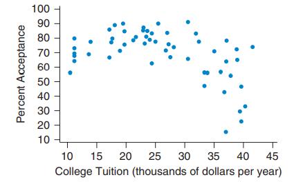
a. The first scatterplot shows the college tuition and percentage acceptance at some colleges in Massachusetts. Would
Question:
a. The first scatterplot shows the college tuition and percentage acceptance at some colleges in Massachusetts. Would it make sense to find the correlation using this data set? Why or why not?
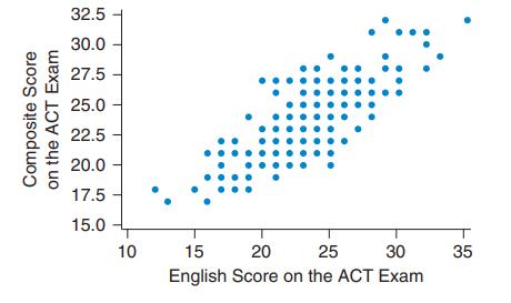
b. The second scatterplot shows the composite grade on the ACT (American College Testing) exam and the English grade on the same exam. Would it make sense to find the correlation using this data set? Why or why not?
Fantastic news! We've Found the answer you've been seeking!
Step by Step Answer:
a You should not find the ...View the full answer

Answered By
Benard Ndini Mwendwa
I am a graduate from Kenya. I managed to score one of the highest levels in my BS. I have experience in academic writing since I have been working as a freelancer in most of my time. I am willing to help other students attain better grades in their academic portfolio. Thank you.
107+ Reviews
240+ Question Solved
Related Book For 
Essential Statistics
ISBN: 9780134134406
2nd Edition
Authors: Robert Gould, Colleen N. Ryan, Rebecca Wong
Question Posted:
