

Which of the following graphs would be best for visually illustrating the data in the table: histogram;
Question:
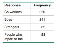
Which of the following graphs would be best for visually illustrating the data in the table: histogram; dotplot; scatterplot; Pareto chart; stemplot?
Refer to the table in the margin, which summarizes results from 641 people who responded to a USA Today survey. Participants responded to this question: “Who do you most like to get compliments from at work?”
Fantastic news! We've Found the answer you've been seeking!
Step by Step Answer:

Answered By
Fahmin Arakkal
Tutoring and Contributing expert question and answers to teachers and students.
Primarily oversees the Heat and Mass Transfer contents presented on websites and blogs.
Responsible for Creating, Editing, Updating all contents related Chemical Engineering in
latex language
8+ Reviews
22+ Question Solved
Related Book For 

Question Posted:
