

Draw a time-series graph of the quantity of compact discs sold. Say in which year or years
Question:
Draw a time-series graph of the quantity of compact discs sold. Say in which year or years the quantity sold
(a) was highest,
(b) was lowest,
(c) increased the most, and
(d) decreased the most. If the data show a trend, describe it.
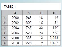
The spreadsheet in Table 1 provides data on the U.S. economy: Column A is the year; the other columns are quantities sold in millions per year of compact discs (column B), music videos (column C), and singles downloads (column D). Use this spreadsheet to work Problems 1 and 2.
Table 1
Fantastic news! We've Found the answer you've been seeking!
Step by Step Answer:
ANSWER a Here is the graph b The timeseries graph ...View the full answer

Answered By
Fahmin Arakkal
Tutoring and Contributing expert question and answers to teachers and students.
Primarily oversees the Heat and Mass Transfer contents presented on websites and blogs.
Responsible for Creating, Editing, Updating all contents related Chemical Engineering in
latex language
8+ Reviews
22+ Question Solved
Related Book For 

Question Posted:
