

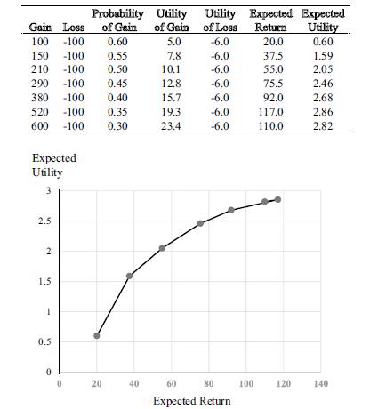
Figure 2. 2 gives an example of a utility curve for a risky investment. For this risky
Question:
Figure 2. 2 gives an example of a utility curve for a risky investment. For this risky investment, expected utility is on the Y-axis, and expected returns are on the X-axis. What is the main concept conveyed by this graph?
Figure 2.2
Step by Step Answer:

This question has not been answered yet.
You can Ask your question!
Related Book For 
Investment Valuation And Asset Pricing Models And Methods
ISBN: 9783031167836
1st Edition
Authors: James W. Kolari, Seppo Pynnönen
Question Posted:
