

The accompanying diagram shows foreign-owned assets in the United States and U.S.-owned assets abroad, both as a
Question:
The accompanying diagram shows foreign-owned assets in the United States and U.S.-owned assets abroad, both as a percentage of foreign GDP. As you can see from the diagram, both increased around fivefold from 1980 to 2013.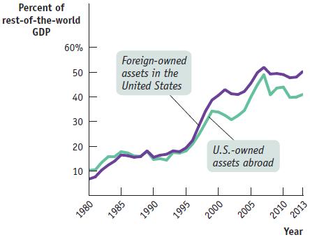
a. As U.S.-owned assets abroad increased as a percentage of foreign GDP, does this mean that the United States, over the period, experienced net capital outflows?
b. Does this diagram indicate that world economies were more tightly linked in 2013 than they were in 1980?
Fantastic news! We've Found the answer you've been seeking!
Step by Step Answer:

Answered By
PALASH JHANWAR
I am a Chartered Accountant with AIR 45 in CA - IPCC. I am a Merit Holder ( B.Com ). The following is my educational details.
PLEASE ACCESS MY RESUME FROM THE FOLLOWING LINK: https://drive.google.com/file/d/1hYR1uch-ff6MRC_cDB07K6VqY9kQ3SFL/view?usp=sharing
3+ Reviews
10+ Question Solved
Related Book For 
Question Posted:
