

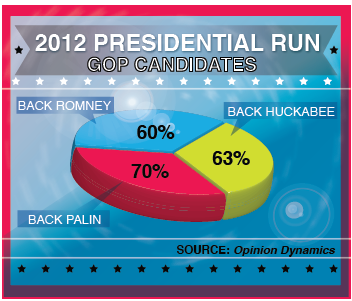
Interpreting a graph about political support: As we learned in this chapter, pie charts are often not
Question:
a. What is the primary flaw in this presentation of data as a pie chart?
b. How would you redesign this graph? Be specific and cite at least three ways in which you would change it.
Fantastic news! We've Found the answer you've been seeking!
Step by Step Answer:
a Data can almost always be presented more clearly in a bar gr...View the full answer

Answered By
FREDRICK MUSYOKI
Professional Qualities:
Solution-oriented.
Self-motivated.
Excellent problem-solving and critical thinking skills.
Good organization, time management and prioritization.
Efficient troubleshooting abilities.
Tutoring Qualities:
I appreciate students as individuals.
I am used to tailoring resources for individual needs.
I can integrate IT into student's lessons.
I am good at explaining concepts.
I am able to help students progress.
I have a wide curriculum knowledge.
1+ Reviews
10+ Question Solved
Related Book For 

Essentials Of Statistics For The Behavioral Sciences
ISBN: 9781464107771
3rd Edition
Authors: Susan A. Nolan
Question Posted:
