

Researchers surveyed Canadian students on their perceptions of the globalization of their campuses (Lambert & Usher, 2013).
Question:
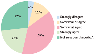
a. What is the story that these data are telling?
b. Why would a bar graph of these data tell this story better than a pie chart does?
c. Create a bar graph of these data, keeping the bars in the order of the labels here€”from €œStrongly disagree€ on the left to €œNot sure/Don€™t know/N/A€ on the right.
d. Why would it not make sense to create a Pareto chart in this case?
Fantastic news! We've Found the answer you've been seeking!
Step by Step Answer:
a These data tell us that most domestic Canadian students x 59 x strongly agreed or somewhat agreed ...View the full answer

Answered By
Gilbert Chesire
I am a diligent writer who understands the writing conventions used in the industry and with the expertise to produce high quality papers at all times. I love to write plagiarism free work with which the grammar flows perfectly. I write both academics and articles with a lot of enthusiasm. I am always determined to put the interests of my customers before mine so as to build a cohesive environment where we can benefit from each other. I value all my clients and I pay them back by delivering the quality of work they yearn to get.
14+ Reviews
49+ Question Solved
Related Book For 

Essentials Of Statistics For The Behavioral Sciences
ISBN: 9781464107771
3rd Edition
Authors: Susan A. Nolan
Question Posted:
