

Draw a scatter diagram of the price of gasoline and the quantity of gasoline refined. Describe the
Question:
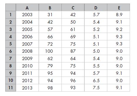
Draw a scatter diagram of the price of gasoline and the quantity of gasoline refined. Describe the relationship.
The spreadsheet provides data on oil and gasoline:
Column A is the year, column B is the price of oil (dollars per barrel), column C is the price of gasoline (cents per litre), column D is oil production, and column E is the quantity of gasoline refined (both in millions of barrels per day).
Step by Step Answer:

This question has not been answered yet.
You can Ask your question!
Related Book For 

Microeconomics Canada In The Global Environment
ISBN: 9780321931184
9th Edition
Authors: Robin Bade, Michael Parkin
Question Posted:
