

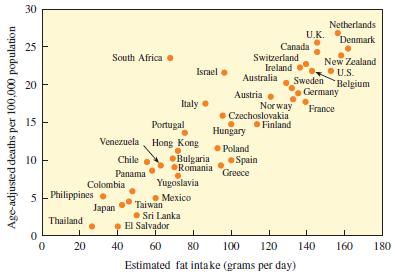
Discuss the correlation shown by the following chart. Age-adjusted deaths per 100,000 population 30 25 20 15
Question:
Discuss the correlation shown by the following chart.
Fantastic news! We've Found the answer you've been seeking!
Step by Step Answer:
The chart youve presented appears to be a scatter plot illustrating the relationship between estimated fat intake in grams per day and ageadjusted dea...View the full answer

Answered By
GERALD KAMAU
non-plagiarism work, timely work and A++ work
6+ Reviews
11+ Question Solved
Related Book For 

Question Posted:
