Using Figure 14.12 (Problem 6), when, and for what, were there no changes when compared to the
Question:
Using Figure 14.12 (Problem 6), when, and for what, were there no changes when compared to the previous year?
Data from Problem 6
Consider the graph shown in Figure 14.12.
Figure 14.12
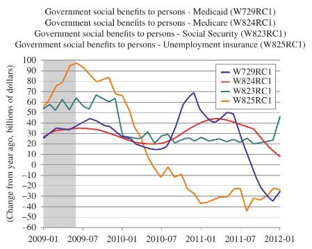
a. How many types of payments are tracked? Can you think of any other payments that might have been included? If so, why do you think they have not been included?
b. In January 2009 the red and blue graphs seem to be about 25 on the vertical scale. What does this number represent?
c. Late in 2010 one curve crosses -20 on the vertical scale. What does this represent?
d. In which year(s) were the various networks tracked? 2009-2012 What do you suppose the " 01 " and " 07 " after the years represents?
e. Which payments had the highest (and when) change from the previous year? Unemployment in July 2009 reached a \(\$ 98\) billion increase over the previous year.
A newspaper article discussing whether Social Security could be cut offered the information shown in Figure 14.25. Use the information in these graphs to answer the questions in Problems 52-58.
Step by Step Answer:

This question has not been answered yet.
You can Ask your question!