

The bar graph displays data on the percent of people in several age groups who attended a
Question:
The bar graph displays data on the percent of people in several age groups who attended a movie in the past 12 months.
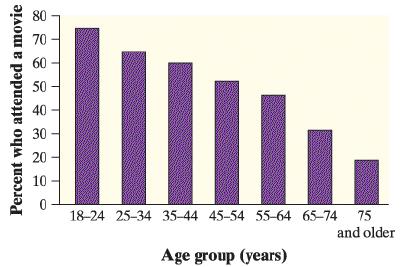
a. Describe what the graph reveals about the relationship between age group and movie attendance.
b. Would it be appropriate to make a pie chart of the data? Explain.
Fantastic news! We've Found the answer you've been seeking!
Step by Step Answer:
A The graph in the figure shows that the percentage of people attending a movie in the past 12 m...View the full answer

Answered By
Dr Navin Gopnarayan
While acing my own studies, my classmates would resort to me whenever they found a teacher/doctor's explanation complicated for me to simplify things as much as possible. That made some ask for tutoring sessions from which they learned so much more than they did in class and ended up passing their subjects.
It is usually a frustrating task when you have to work with teammates; thats not the case for me as I find joy and satisfaction in disintangling a hard question or pouring over lines of code to get the successful run of the required aspect.
As programmers we are asked to find the optimal solutions, and that skill finds its way into many aspects of our lives, weather it be simplicity or saving energy or money, we find the best way we can. That is what I would provide you with when you ask for it.
0 Reviews
10+ Question Solved
Related Book For 

Question Posted:
