

By using the data in the following table, create two graphs. The first graph should plot the
Question:
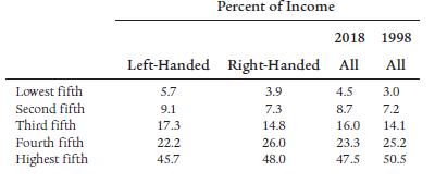
By using the data in the following table, create two graphs. The first graph should plot the Lorenz curves for left-handed people and right-handed people. The second graph should plot the Lorenz curve for the 1998 “all” data and the Lorenz curve for the 2018 “all” data. In each graph, which has the higher Gini coefficient? How do you interpret the result?
Fantastic news! We've Found the answer you've been seeking!
Step by Step Answer:
Lets delve into the situation faced by Vesuvius and Etna Vesuvius Vesuvius has a lower margin...View the full answer

Answered By
Sidharth Jain
My name is Sidharth. I completed engineering from National Institute of Technology Durgapur which is one of the top college in India. I am currently working as an Maths Faculty in one of the biggest IITJEE institute in India. Due to my passion in teaching and Maths, I came to this field. I've been teaching for almost 3 years.
Apart from it I also worked as an Expert Answerer on Chegg.com. I have many clients from USA to whom I teach online and help them in their assignments. I worked on many online classes on mymathlab and webassign. I guarantee for grade 'A'.
3+ Reviews
10+ Question Solved
Related Book For 

Principles Of Economics
ISBN: 9781292294698
13th Global Edition
Authors: Karl E. Case, Ray C. Fair, Sharon E. Oster
Question Posted:
