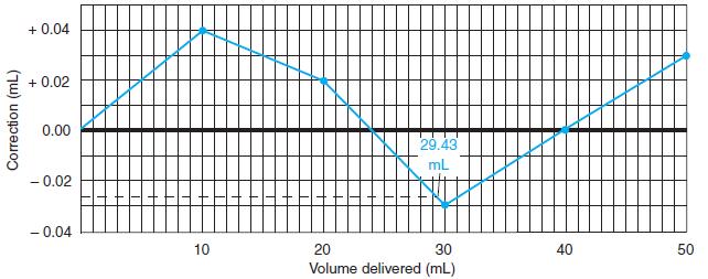
Controlling the appearance of a graph. Figure 3-3 requires gridlines to read buret corrections. In this exercise,
Question:
Controlling the appearance of a graph. Figure 3-3 requires gridlines to read buret corrections. In this exercise, you will format a graph so that it looks like Figure 3-3. Follow the procedure in Section 2-11 to graph the data in the following table. For Excel 2007, insert a Chart of the type Scatter with data points connected by straight lines. Delete the legend and title. With Chart Tools, Layout, Axis Titles, add labels for both axes. Click any number on the abscissa (x-axis) and go to Chart Tools, Format. In Format Selection, Axis Options, choose Minimum = 0, Maximum = 50, Major unit = 10, and Minor unit = 1. In Format Selection, Number, choose Number and set Decimal places = 0. In a similar manner, set the ordinate (y-axis) to run from - 0.04 to +0.05 with a Major unit of 0.02 and a Minor unit of 0.01. To display gridlines, go to Chart Tools, Layout, and Gridlines. For Primary Horizontal Gridlines, select Major & Minor Gridlines. For Primary Vertical Gridlines, select Major & Minor Gridlines. To move x-axis labels from the middle of the chart to the bottom, click a number on the y-axis (not the x-axis) and select Chart Tools, Layout, Format Selection. In Axis Options, choose Horizontal axis crosses Axis value and type in - 0.04. Close the Format Axis window and your graph should look like Figure 3-3.
For earlier versions of Excel, select Chart Type XY (Scatter) showing data points connected by straight lines. Double click the x-axis and select the Scale tab. Set Minimum = 0, Maximum = 50, Major unit = 10, and Minor unit = 1. Select the Number tab and highlight Number. Set Decimal places = 0. In a similar manner, set the ordinate to run from - 0.04 to + 0.05 with a Major unit of 0.02 and a Minor unit of 0.01, as in Figure 3-3. The spreadsheet might overrule you. Continue to reset the limits you want and click OK each time until the graph looks the way you intend. To add gridlines, click inside the graph, go to the Chart menu and select Chart Options. Select the Gridlines tab and check both sets of Major gridlines and Minor gridlines and click OK. In Chart Options, select the Legend tab and deselect Show legend. To move x-axis numbers to the bottom of the chart, double click the y-axis (not the x-axis) and select the Scale tab. Set “Value (x) axis crosses at” to - 0.04. Click OK and your graph should look like Figure 3-3.
Volume (mL) ……………….. Correction (mL)
0.03 ……………………………… 0.00
10.04 ……………………………… 0.04
20.03 ……………………………… 0.02
29.98 ……………………………… - 0.03
40.00 ……………………………… 0.00
49.97 ……………………………… 0.03
Figure 3-3
Step by Step Answer:
In every aspect of our lives datainformation numbers words or imagesare collected recorded ana...View the full answer