

1. Download the data into Excel (5%) The data consists of the annual averaged global surface temperature...
Question:
1. Download the data into Excel (5%)
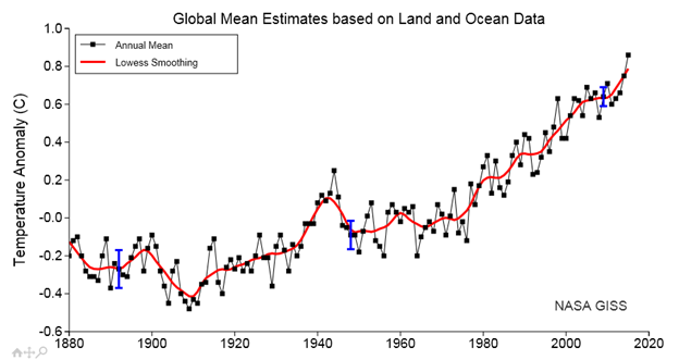
The data consists of the annual averaged global surface temperature anomalies from 1880 to 2020, based on observations over land and the oceans. The temperature values are given as anomalies instead of the actual temperatures. The anomalies are defined as the difference between the actual annual temperature and the average temperature from 1951 to 1980 (the so-called base period). The data was made available by NASA GISS (Goddard Institute for Space Studies).
This link is a text file that has 5 header lines at the top followed by 3 columns of numbers. The first column is the year, the second column is the global temperature anomaly, and the third column is the global temperature anomaly that has been smoothed to filter out some of the faster (less than 5 year) inter-annual fluctuations.
There are many ways of transferring the data into an Excel spreadsheet. If you already know how to do it, then use your method to transfer the data into 3 adjacent columns in a blank Excel sheet. Otherwise follow these detailed instructions:
- Use your mouse to select the 3 columns of numbers (skip the first 5 header lines). This can be done by keeping the left mouse button depressed as you drag the mouse to select the 3 entire columns. The 3 columns should now be highlighted. Right click the mouse and select "Copy".
- Start a new Excel workspace with a blank sheet and click on the upper left-most cell (A1) to select it. Then right click the mouse and choose "Paste". This will import the data into the Excel sheet.
- However, notice that all 3 columns have been pasted into the A column. We need to separate this in 3 separate columns. Do this by selecting column A (left click on it) and then click on the "Data" tab on the top of the Excel window.
- In the "Data Tools" section, click on "Text to Columns". This will open a "Convert Text to Columns Wizard" window.
- In the first step click on the "Fixed Width" button. Then click "Next".
- In Step 2, you can adjust the separation of the columns. Note that vertical lines appear between the columns indicating how the columns will be separated. The default should be correct. Click on the "Next" button.
- Step 3 allows you to change the data formatting. Keep it as the default "General" and click on "Finish". Note that the 3 data columns have now been given their own columns: A, B and C.
2. Create a Chart (5%)
To display the data in an Excel chart, select Columns A, B and C by left click dragging the column headers A, B and C. Click on the "Insert" tab at the top of the Excel window and click on the "Scatter" option in the "Chart" section. This will open an option box. Select "Scatter with Straight Lines and Markers". A chart should appear on the sheet. By default, Column A which contains the years will be the x-axis. Columns B and C with the raw and filtered global temperatures will appear as Series 1 and 2, respectively, on the chart.
3. Improve the Chart's Appearance (80%)
The default chart is rather ugly. Try to improve the chart appearance and readability.
Here is how the chart appears on the NASA GISS website:
Expert Answer:


Statistics For Management And Economics Abbreviated
ISBN: 9781285869643
10th Edition
Authors: Gerald Keller
