Answered step by step
Verified Expert Solution
Question
1 Approved Answer
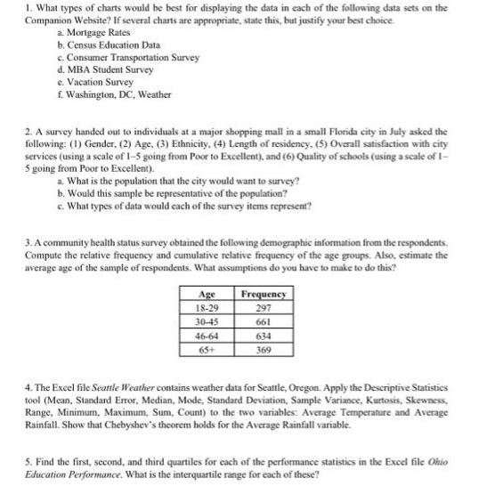
1. What types of charts would be best for displaying the data in each of the following data sets on the Companion Website? If


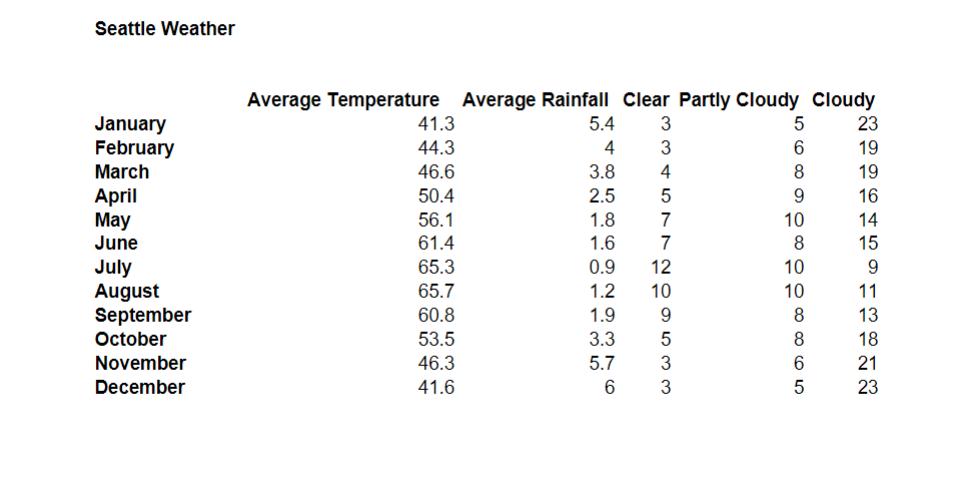
1. What types of charts would be best for displaying the data in each of the following data sets on the Companion Website? If several charts are appropriate, state this, but justify your best choice. a. Mortgage Rates b. Census Education Data c. Consumer Transportation Survey d. MBA Student Survey e. Vacation Survey f. Washington, DC, Weather 2. A survey handed out to individuals at a major shopping mall in a small Florida city in July asked the following: (1) Gender, (2) Age, (3) Ethnicity, (4) Length of residency, (5) Overall satisfaction with city services (using a scale of 1-5 going from Poor to Excellent), and (6) Quality of schools (using a scale of 1- 5 going from Poor to Excellent). a. What is the population that the city would want to survey? b. Would this sample be representative of the population? c. What types of data would each of the survey items represent? 3. A community health status survey obtained the following demographic information from the respondents. Compute the relative frequency and cumulative relative frequency of the age groups. Also, estimate the average age of the sample of respondents. What assumptions do you have to make to do this? Age 18-29 30-45 46-64 65+ Frequency 297 661 634 369 4. The Excel file Seattle Weather contains weather data for Seattle, Oregon. Apply the Descriptive Statistics tool (Mean, Standard Error, Median, Mode, Standard Deviation, Sample Variance, Kurtosis, Skewness, Range, Minimum, Maximum, Sum, Count) to the two variables: Average Temperature and Average Rainfall. Show that Chebyshev's theorem holds for the Average Rainfall variable. 5. Find the first, second, and third quartiles for each of the performance statistics in the Excel file Ohio Education Performance. What is the interquartile range for each of these? Seattle Weather January February March April May June July August September October November December Average Temperature Average Rainfall Clear Partly Cloudy Cloudy 3 3 41.3 44.3 46.6 50.4 56.1 61.4 65.3 65.7 60.8 53.5 46.3 41.6 5.4 4 3.8 2.5 4 5 1.8 1.6 0.9 1.2 1.9 9 3.3 5 5.7 3 6 3 7 7 12 10 5 23 6 19 8 9 10 8 10 10 8 8 65 19 16 14 15 9 11 13 18 21 23
Step by Step Solution
★★★★★
3.45 Rating (158 Votes )
There are 3 Steps involved in it
Step: 1
1 a The best chart to display mortgage rates would be a line graph This allows for the rate to be displayed over a period of time which is the best way to interpret the data b A bar graph would be bes...
Get Instant Access to Expert-Tailored Solutions
See step-by-step solutions with expert insights and AI powered tools for academic success
Step: 2

Step: 3

Ace Your Homework with AI
Get the answers you need in no time with our AI-driven, step-by-step assistance
Get Started


