

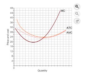
The graph to the right shows a firm in a perfectly competitive market making a profit. The
Fantastic news! We've Found the answer you've been seeking!
Question:
The graph to the right shows a firm in a perfectly competitive market making a profit. The graph includes the firm's marginal cost curve, average total cost curve, and average variable cost curve.
Assume the market price is $32.
1.) Use the line drawing tool to graph the firm's demand curve. Label this line 'Demand'.
2.) Use the point drawing tool to plot the firm's profit-maximizing price and quantity. Label this point 'Point A'.
3.) Use the rectangle drawing tool to shade in the firm's profit (Profit/Loss). Properly label this shaded area.
Carefully follow the instructions above, and only draw the required objects.
Expert Answer:
In perfect competition price is constant at every quantity and thats why the dema... View the full answer

Related Book For 
Foundations of Finance The Logic and Practice of Financial Management
ISBN: 978-0132994873
8th edition
Authors: Arthur J. Keown, John D. Martin, J. William Petty
Posted Date:
