

d) A descriptive comment before each function/method Assignment Details: As an Information Technology professional, much of...
Fantastic news! We've Found the answer you've been seeking!
Question:
Transcribed Image Text:
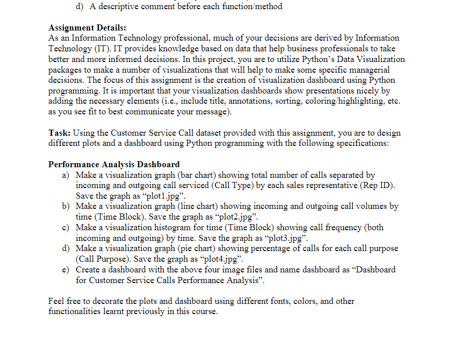
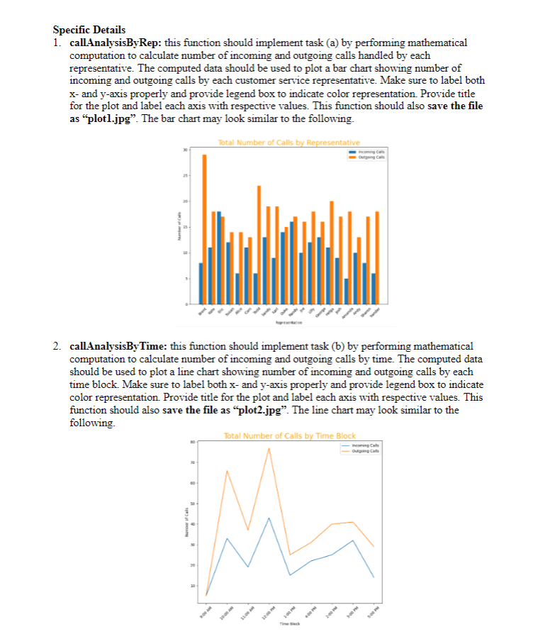
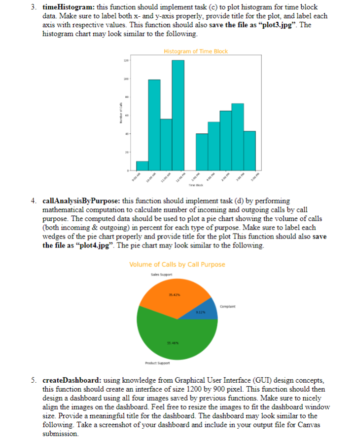
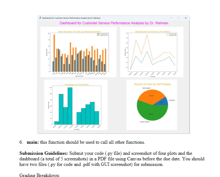
d) A descriptive comment before each function/method Assignment Details: As an Information Technology professional, much of your decisions are derived by Information Technology (IT). IT provides knowledge based on data that help business professionals to take better and more informed decisions. In this project, you are to utilize Python's Data Visualization packages to make a number of visualizations that will help to make some specific managerial decisions. The focus of this assignment is the creation of visualization dashboard using Python programming. It is important that your visualization dashboards show presentations nicely by adding the necessary elements (i.e., include title, annotations, sorting, coloring/highlighting, etc. as you see fit to best communicate your message). Task: Using the Customer Service Call dataset provided with this assignment, you are to design different plots and a dashboard using Python programming with the following specifications: Performance Analysis Dashboard a) Make a visualization graph (bar chart) showing total number of calls separated by incoming and outgoing call serviced (Call Type) by each sales representative (Rep ID). Save the graph as "plot1.jpg". b) Make a visualization graph (line chart) showing incoming and outgoing call volumes by time (Time Block). Save the graph as "plot2.jpg". c) Make a visualization histogram for time (Time Block) showing call frequency (both incoming and outgoing) by time. Save the graph as "plot3.jpg". d) Make a visualization graph (pie chart) showing percentage of calls for each call purpose (Call Purpose). Save the graph as "plot4.jpg". e) Create a dashboard with the above four image files and name dashboard as "Dashboard for Customer Service Calls Performance Analysis". Feel free to decorate the plots and dashboard using different fonts, colors, and other functionalities learnt previously in this course. Specific Details 1. callAnalysisByRep: this function should implement task (a) by performing mathematical computation to calculate number of incoming and outgoing calls handled by each representative. The computed data should be used to plot a bar chart showing number of incoming and outgoing calls by each customer service representative. Make sure to label both x- and y-axis properly and provide legend box to indicate color representation. Provide title for the plot and label each axis with respective values. This function should also save the file as "plotl.jpg". The bar chart may look similar to the following. Total Number of Calls by Representative Number of Cal Numer of Cal 2. callAnalysisByTime: this function should implement task (b) by performing mathematical computation to calculate number of incoming and outgoing calls by time. The computed data should be used to plot a line chart showing number of incoming and outgoing calls by each time block. Make sure to label both x- and y-axis properly and provide legend box to indicate color representation. Provide title for the plot and label each axis with respective values. This function should also save the file as "plot2.jpg". The line chart may look similar to the following. 2 8 6 Outgoing Calls 3 Total Number of Calls by Time Block Time Sk Incoming Calls Outgoing Cats 5:00 PM 3. timeHistogram: this function should implement task (c) to plot histogram for time block data. Make sure to label both x- and y-axis properly, provide title for the plot, and label each axis with respective values. This function should also save the file as "plot3.jpg". The histogram chart may look similar to the following. Histogram of Time Block 120- 100 4. callAnalysisBy Purpose: this function should implement task (d) by performing mathematical computation to calculate number of incoming and outgoing calls by call purpose. The computed data should be used to plot a pie chart showing the volume of calls (both incoming & outgoing) in percent for each type of purpose. Make sure to label each wedges of the pie chart properly and provide title for the plot This function should also save the file as "plot4.jpg". The pie chart may look similar to the following. Volume of Calls by Call Purpose Sales Support 35.42% Product Support 3.12% Complaint 5. createDashboard: using knowledge from Graphical User Interface (GUI) design concepts, this function should create an interface of size 1200 by 900 pixel. This function should then design a dashboard using all four images saved by previous functions. Make sure to nicely align the images on the dashboard. Feel free to resize the images to fit the dashboard window size. Provide a meaningful title for the dashboard. The dashboard may look similar to the following. Take a screenshot of your dashboard and include in your output file for Canvas submission. Dashboard for Customer Service Performance Analysis by Dr. Rahman Dashboard for Customer Service Performance Analysis by Dr. Rahman Total Number of Calls by Representativ Total Number of Calls by Time Block Grading Breakdown: Volume of Calls by Call Purpose 6. main: this function should be used to call all other functions. Submission Guidelines: Submit your code (.py file) and screenshot of four plots and the dashboard (a total of 5 screenshots) in a PDF file using Canvas before the due date. You should have two files (.py for code and .pdf with GUI screenshot) for submission. d) A descriptive comment before each function/method Assignment Details: As an Information Technology professional, much of your decisions are derived by Information Technology (IT). IT provides knowledge based on data that help business professionals to take better and more informed decisions. In this project, you are to utilize Python's Data Visualization packages to make a number of visualizations that will help to make some specific managerial decisions. The focus of this assignment is the creation of visualization dashboard using Python programming. It is important that your visualization dashboards show presentations nicely by adding the necessary elements (i.e., include title, annotations, sorting, coloring/highlighting, etc. as you see fit to best communicate your message). Task: Using the Customer Service Call dataset provided with this assignment, you are to design different plots and a dashboard using Python programming with the following specifications: Performance Analysis Dashboard a) Make a visualization graph (bar chart) showing total number of calls separated by incoming and outgoing call serviced (Call Type) by each sales representative (Rep ID). Save the graph as "plot1.jpg". b) Make a visualization graph (line chart) showing incoming and outgoing call volumes by time (Time Block). Save the graph as "plot2.jpg". c) Make a visualization histogram for time (Time Block) showing call frequency (both incoming and outgoing) by time. Save the graph as "plot3.jpg". d) Make a visualization graph (pie chart) showing percentage of calls for each call purpose (Call Purpose). Save the graph as "plot4.jpg". e) Create a dashboard with the above four image files and name dashboard as "Dashboard for Customer Service Calls Performance Analysis". Feel free to decorate the plots and dashboard using different fonts, colors, and other functionalities learnt previously in this course. Specific Details 1. callAnalysisByRep: this function should implement task (a) by performing mathematical computation to calculate number of incoming and outgoing calls handled by each representative. The computed data should be used to plot a bar chart showing number of incoming and outgoing calls by each customer service representative. Make sure to label both x- and y-axis properly and provide legend box to indicate color representation. Provide title for the plot and label each axis with respective values. This function should also save the file as "plotl.jpg". The bar chart may look similar to the following. Total Number of Calls by Representative Number of Cal Numer of Cal 2. callAnalysisByTime: this function should implement task (b) by performing mathematical computation to calculate number of incoming and outgoing calls by time. The computed data should be used to plot a line chart showing number of incoming and outgoing calls by each time block. Make sure to label both x- and y-axis properly and provide legend box to indicate color representation. Provide title for the plot and label each axis with respective values. This function should also save the file as "plot2.jpg". The line chart may look similar to the following. 2 8 6 Outgoing Calls 3 Total Number of Calls by Time Block Time Sk Incoming Calls Outgoing Cats 5:00 PM 3. timeHistogram: this function should implement task (c) to plot histogram for time block data. Make sure to label both x- and y-axis properly, provide title for the plot, and label each axis with respective values. This function should also save the file as "plot3.jpg". The histogram chart may look similar to the following. Histogram of Time Block 120- 100 4. callAnalysisBy Purpose: this function should implement task (d) by performing mathematical computation to calculate number of incoming and outgoing calls by call purpose. The computed data should be used to plot a pie chart showing the volume of calls (both incoming & outgoing) in percent for each type of purpose. Make sure to label each wedges of the pie chart properly and provide title for the plot This function should also save the file as "plot4.jpg". The pie chart may look similar to the following. Volume of Calls by Call Purpose Sales Support 35.42% Product Support 3.12% Complaint 5. createDashboard: using knowledge from Graphical User Interface (GUI) design concepts, this function should create an interface of size 1200 by 900 pixel. This function should then design a dashboard using all four images saved by previous functions. Make sure to nicely align the images on the dashboard. Feel free to resize the images to fit the dashboard window size. Provide a meaningful title for the dashboard. The dashboard may look similar to the following. Take a screenshot of your dashboard and include in your output file for Canvas submission. Dashboard for Customer Service Performance Analysis by Dr. Rahman Dashboard for Customer Service Performance Analysis by Dr. Rahman Total Number of Calls by Representativ Total Number of Calls by Time Block Grading Breakdown: Volume of Calls by Call Purpose 6. main: this function should be used to call all other functions. Submission Guidelines: Submit your code (.py file) and screenshot of four plots and the dashboard (a total of 5 screenshots) in a PDF file using Canvas before the due date. You should have two files (.py for code and .pdf with GUI screenshot) for submission.
Expert Answer:
Answer rating: 100% (QA)
Descriptive comments before each functionmethod a barchartcallsbyrep This function generates a bar c... View the full answer

Related Book For 

Auditing and Assurance services an integrated approach
ISBN: 978-0134065823
16th edition
Authors: Alvin A. Arens, Randal J. Elder, Mark S. Beasley, Chris E. Hogan
Posted Date:
Students also viewed these programming questions
-
The Sweet Basil just borrowed $700,000 [PV] to build a new restaurant. The loan terms call for equal annual payments at the end of each year. The loan is for 15 years at an APR of 8.35 percent. How...
-
Planning is one of the most important management functions in any business. A front office managers first step in planning should involve determine the departments goals. Planning also includes...
-
List three specific parts of the Case Guide, Objectives and Strategy Section (See below) that you had the most difficulty understanding. Describe your current understanding of these parts. Provide...
-
Perform the indicated operations. (3k + q)
-
Two rays traveling parallel to the principal axis strike a large plano-convex lens having a refractive index of 1.60 (Fig. P36.45). If the convex face is spherical, a ray near the edge does not pass...
-
An enterprising student invests $1,000 at an annual interest rate that will grow the original investment to $2,000 in four years. In four more years, the amount will grow to $4,000, and this pattern...
-
The triangular plate ABC is deformed into the shape shown by the dashed lines. If at A, AB = 0.0075, AC = 0.01 and xy = 0.005 rad, determine the average normal strain along edge BC. C y 300 mm...
-
Transworld Moving, like other moving companies, closely follows the impact of road construction to make sure that its routes remain the most efficient. Unfortunately, there has been unexpected road...
-
Liquid leaked from a damaged tank at a rate of r(t) liters per hour. The rate decreased as time passed and values of the rate at two-hour time intervals are shown in the table. t (hr) r(t) (L/h) 0...
-
The Income Statement and Balance Sheet consistently tell a financial story. That story has many chapters and can change dramatically based upon macroeconomic conditions. Locate the Form 10-K of a...
-
A survey of 85 homeowners finds that they spend on average $67 a month on home maintenance. At the 95% confidence level, the margin of error (E) for the mean amount spent on home maintenance by all...
-
Given the following Adjustable Rate Mortgage (ARM): Loan amount: Term: $100,000 20 years, monthly payment Discount point and fee: $8,000 Teaser rate: Margin: 7.25% 225 basis points Rate caps: 2.5%...
-
Ashley, a twenty-one-year-old college graduate with a 3.5 GPA, was hired for her first job. She was a fast learner on all the soft-ware, but her supervisor had to help her with punctuation. On the...
-
Air enters an adiabatic nozzle at 60 ft/sec, 180 psia and 480 F and, after expansion, leaves the nozzle at 15 psia. Use constant specific heats to calculate the nozzle exit velocity (use a reference...
-
Paloma Company has four employees. FICA Social Security taxes are 6.2% of the first $137,700 paid to each employee, and FICA Medicare taxes are 1.45% of gross pay. Also, for the first $7,000 paid to...
-
Directions: Analyze each of the following arguments in terms of new case, comparison cases, known similarities, and inferred similarity. Then indicate what seems to you the most significant relevant...
-
what are Reasons for the some biological biological, psychosocial for topolan disorden?
-
Find the radius of convergence of? 1.2.3 1.3.5 (2n-1) r2n+1 -1
-
Describe factors the auditor should consider in developing an expectation for depreciation while performing a substantive analytical procedure for depreciation expense.
-
This problem requires you to access PCAOB Auditing Standard No. 12, Identifying and Assessing Risks of Material Misstatements (pcaobus.org). Use this standard to answer each of the questions below....
-
Provide two examples of factors that might increase the risk of material misstatement at the overall financial statement level.
-
What are the differences among an onsite team, a virtual team, a task force, and a committee? What are some of the potential differences in dynamics between people in these different groups?
-
Compare and contrast disciplinary, interdisciplinary, and crossfunctional teams.
-
What are some of the unique challenges associated with teamwork in health care? How do you see teamwork fitting in with the accountable care organization (ACO) mandates? Describe three benefits and...

Study smarter with the SolutionInn App