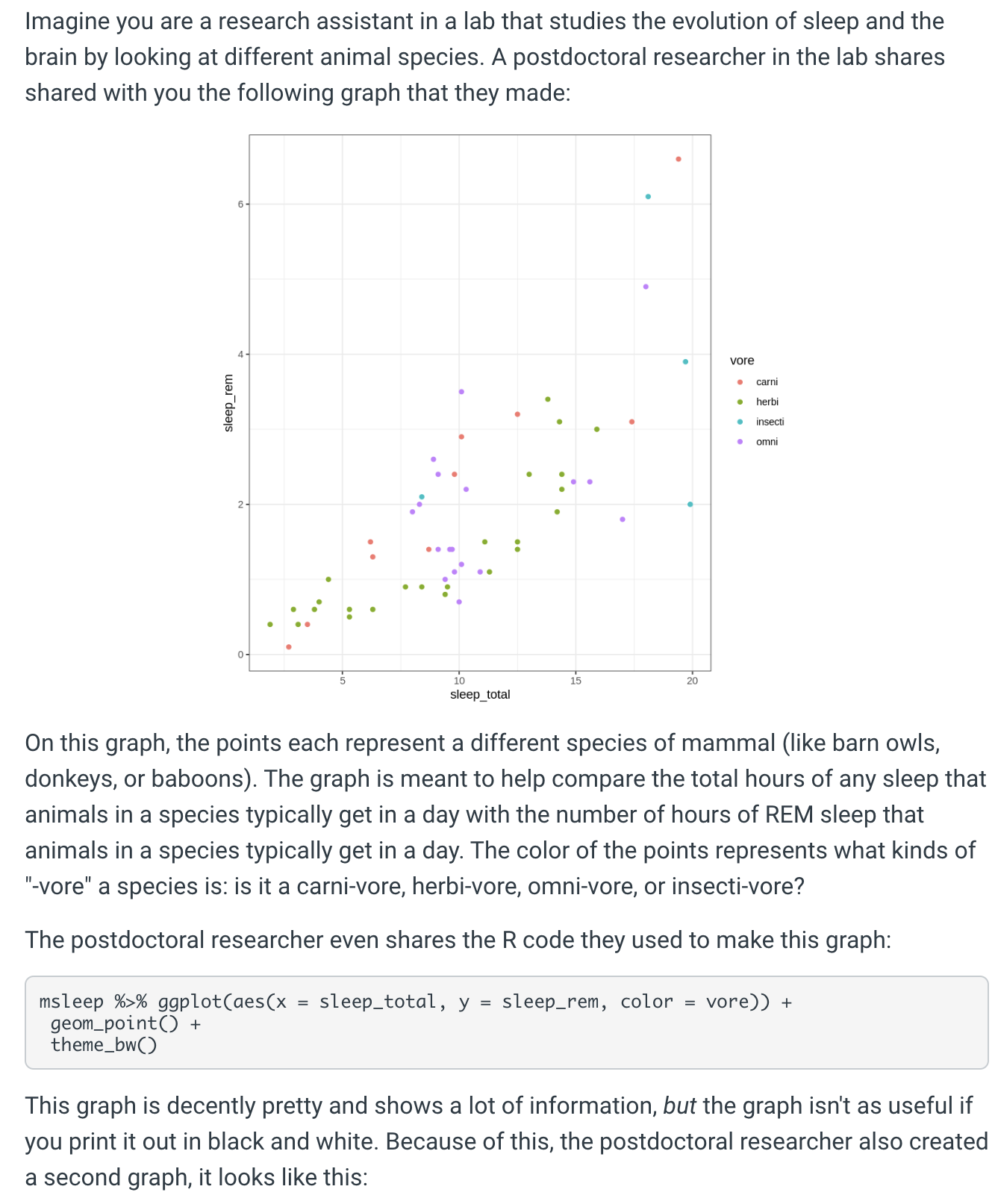
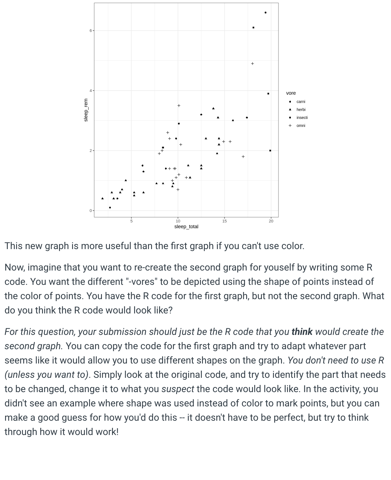
Imagine you are a research assistant in a lab that studies the evolution of sleep and...
Fantastic news! We've Found the answer you've been seeking!
Question:
Transcribed Image Text:
Imagine you are a research assistant in a lab that studies the evolution of sleep and the brain by looking at different animal species. A postdoctoral researcher in the lab shares shared with you the following graph that they made: sleep_rem 6- 2- 0- 10 sleep_total 15 20 msleep %>% ggplot(aes(x = sleep_total, y = sleep_rem, color geom_point() + theme_bw() vore carni herbi insecti omni On this graph, the points each represent a different species of mammal (like barn owls, donkeys, or baboons). The graph is meant to help compare the total hours of any sleep that animals in a species typically get in a day with the number of hours of REM sleep that animals in a species typically get in a day. The color of the points represents what kinds of "-vore" a species is: is it a carni-vore, herbi-vore, omni-vore, or insecti-vore? The postdoctoral researcher even shares the R code they used to make this graph: vore)) + This graph is decently pretty and shows a lot of information, but the graph isn't as useful if you print it out in black and white. Because of this, the postdoctoral researcher also created a second graph, it looks like this: sleep_rem 6- 2- 0- + + 10 sleep_total A + + 20 vore + carni herbi insecti omni This new graph is more useful than the first graph if you can't use color. Now, imagine that you want to re-create the second graph for youself by writing some R code. You want the different "-vores" to be depicted using the shape of points instead of the color of points. You have the R code for the first graph, but not the second graph. What do you think the R code would look like? For this question, your submission should just be the R code that you think would create the second graph. You can copy the code for the first graph and try to adapt whatever part seems like it would allow you to use different shapes on the graph. You don't need to use R (unless you want to). Simply look at the original code, and try to identify the part that needs to be changed, change it to what you suspect the code would look like. In the activity, you didn't see an example where shape was used instead of color to mark points, but you can make a good guess for how you'd do this -- it doesn't have to be perfect, but try to think through how it would work! Imagine you are a research assistant in a lab that studies the evolution of sleep and the brain by looking at different animal species. A postdoctoral researcher in the lab shares shared with you the following graph that they made: sleep_rem 6- 2- 0- 10 sleep_total 15 20 msleep %>% ggplot(aes(x = sleep_total, y = sleep_rem, color geom_point() + theme_bw() vore carni herbi insecti omni On this graph, the points each represent a different species of mammal (like barn owls, donkeys, or baboons). The graph is meant to help compare the total hours of any sleep that animals in a species typically get in a day with the number of hours of REM sleep that animals in a species typically get in a day. The color of the points represents what kinds of "-vore" a species is: is it a carni-vore, herbi-vore, omni-vore, or insecti-vore? The postdoctoral researcher even shares the R code they used to make this graph: vore)) + This graph is decently pretty and shows a lot of information, but the graph isn't as useful if you print it out in black and white. Because of this, the postdoctoral researcher also created a second graph, it looks like this: sleep_rem 6- 2- 0- + + 10 sleep_total A + + 20 vore + carni herbi insecti omni This new graph is more useful than the first graph if you can't use color. Now, imagine that you want to re-create the second graph for youself by writing some R code. You want the different "-vores" to be depicted using the shape of points instead of the color of points. You have the R code for the first graph, but not the second graph. What do you think the R code would look like? For this question, your submission should just be the R code that you think would create the second graph. You can copy the code for the first graph and try to adapt whatever part seems like it would allow you to use different shapes on the graph. You don't need to use R (unless you want to). Simply look at the original code, and try to identify the part that needs to be changed, change it to what you suspect the code would look like. In the activity, you didn't see an example where shape was used instead of color to mark points, but you can make a good guess for how you'd do this -- it doesn't have to be perfect, but try to think through how it would work!
Expert Answer:
Related Book For
Human Anatomy and Physiology
ISBN: 978-0321927040
10th edition
Authors: Elaine N. Marieb, Katja Hoehn
Posted Date:
Students also viewed these algorithms questions
-
Q1. You have identified a market opportunity for home media players that would cater for older members of the population. Many older people have difficulty in understanding the operating principles...
-
1Describe in a simplified manner the flow of information from gene to protein
-
On February 10, Kelm secured a loan for $6,000 from Ms. Joan Williams. Kelm told Williams that the loan was to finance a real estate transaction. Five days later, Ms. Williams received a check drawn...
-
A treasury note with a coupon rate of 16 1/4% that settles on February 15th, 2022 and matures on August 15, 2023. Assuming a quoted price on the note is 104.25, what is the yield on the note (using...
-
(a) identify any outliers (b) draw a modified box-and-whisker plot that represents the data set. Use asterisks (*) to identify outliers. 75 78 80 75 62 72 74 75 80 95 76 72
-
Journal entries and T-accounts. Prepare journal entries and post them to T-accounts for all transactions in Exercise 7-26, including requirement 2. Summarize how these journal entries differ from the...
-
Determine the missing manufacturing cost data for Sunland Company as presented below. (Assume all raw materials used were direct materials.) Case A Case B Case C Direct materials used (a) $87,500...
-
9. Solve the differential equation by undetermined coefficients (annihilator approach). y" + y = 4 cos a sin a
-
Air at 70C is heating solids at 30C by convection. The area of heat transfer is 10 cm2 and the heat transfer coefficient is 2 kJ/cm2/K/s. What is the rate of heat transfer? What are the techniques...
-
Derive the equation for the exit concentration of the solute as function of time for a continuous stirred adsorption unit when the solute is injected in the feed at time = 0 (the adsorption follows a...
-
Investigate how Roblox has done since its public offering. Has the firm been able to realize growth in its core and new markets? Why or why not?
-
How will the settling velocity of a particle change if the rpm of the centrifuges is increased by 25%?
-
Investigate the state of AR and VR. What will it take for these platforms to become more popular? How might the rise of low-cost, high-quality AR/VR headsets impact other industries for platform...
-
Multiple choice exercise-cash flows Exercise 1 Calculate the cash flow from operating activities using the following information (expressed in millions) Net income = 5 Depreciation = 1 Decrease in...
-
Choose two matrices A and B with dimension 2 x 2. Calculate det A, det B, and det (AB). Repeat this process until you are able to discover how these three determinants are related. Summarize your...
-
Florita Santos, a middle-aged woman, is admitted to the coronary care unit with a diagnosis of left ventricular failure resulting from a myocardial infarction. Her history indicated that she was...
-
Contrast the roles of ER-bound ribosomes with those free in the cytosol.
-
Name the three phases of interphase and describe an activity unique to each phase.
-
What are the advantages of using stability approach over direct and analogy approach?
-
Examine Fowlers account pattern on following characteristics: a. Simplicity b. Generality c. Completeness d. Stability e. Visual and graphical model f. Testability
-
Draw a class diagram for resource rental pattern and its installation for library service by using analogy approach.
Study smarter with the SolutionInn App