

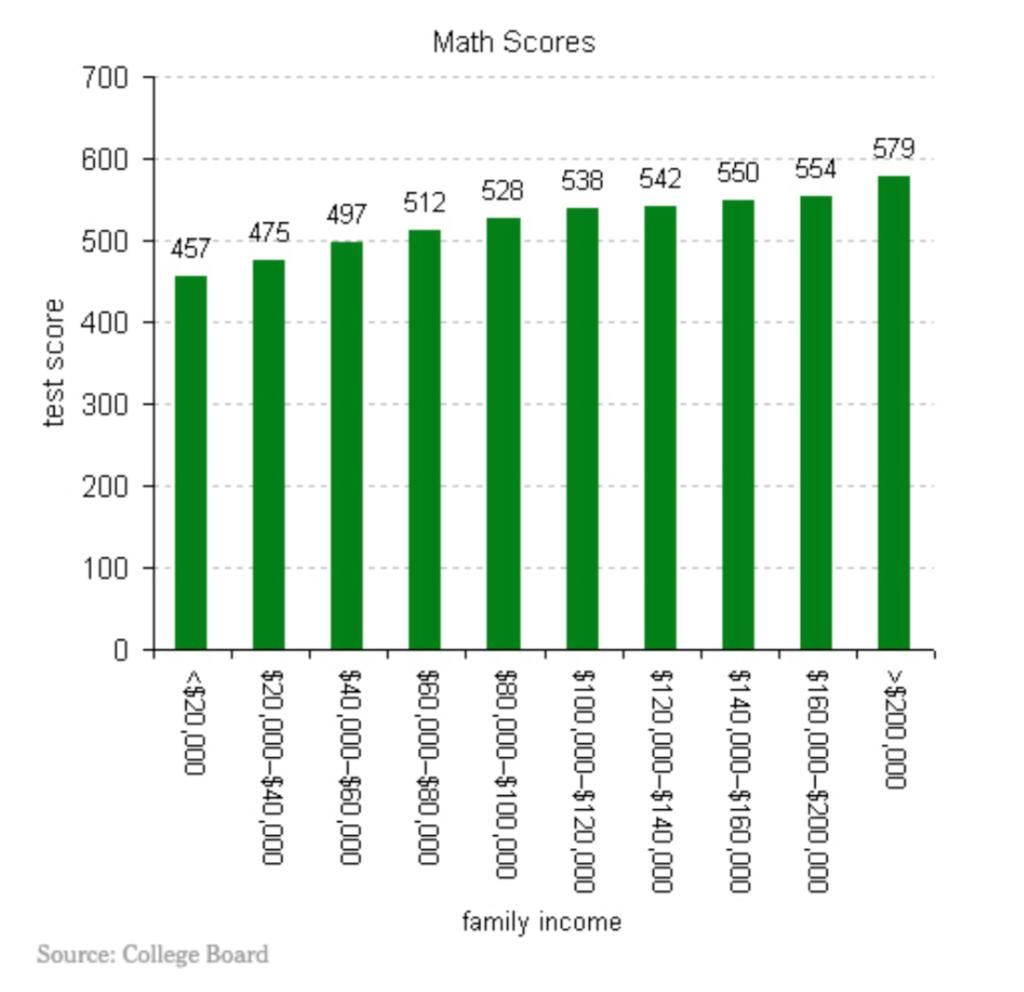
The following bar chart shows the average SAT math scores by parental income groups, using data from
Fantastic news! We've Found the answer you've been seeking!
Question:
The following bar chart shows the average SAT math scores by parental income groups, using data from the US:
Write a multiple regression model such that the coefficients on the x- variables allow us to make inference on the difference in mean SAT scores for students with parents in the highest income group and students with parents in other income groups? Clearly define all the variables in your regression, including the y-variable. Next, also write down what the estimated equation with. Answer with two equations – model and estimated equation – and clear definitions for all the variables in your regression model.
Expert Answer:
The regression can be defined on The dependent variable Y Average SAT math scores ... View the full answer

Related Book For 

Statistics for Business Decision Making and Analysis
ISBN: 978-0134497167
3rd edition
Authors: Robert A. Stine, Dean Foster
Posted Date:
