

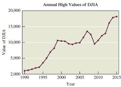
Figure 3.36 on the next page depicts the annual high values of the Dow Jones Industrial Average
Question:
Figure 3.36 on the next page depicts the annual high values of the Dow Jones Industrial Average (DJIA) for stocks. How is this graph misleading? How could it be drawn so that it is not misleading? In this case, would the graph change dramatically if it was not drawn to be misleading?
Fantastic news! We've Found the answer you've been seeking!
Step by Step Answer:
Figure 336 on the next page depicts the annual high values of the Dow Jones Industrial Average DJIA ...View the full answer

Answered By
Labindao Antoque
I graduated in 2018 with a Bachelor of Science degree in Psychology from Dalubhasaan ng Lungsod ng San Pablo. I tutored students in classes and out of classes. I use a variety of strategies to tutor students that include: lecture, discussions about the subject matter, problem solving examples using the principles of the subject matter being discussed in class , homework assignments that are directed towards reinforcing what we learn in class , and detailed practice problems help students to master a concept. I also do thorough research on Internet resources or textbooks so that I know what students need to learn in order to master what is being taught in class .
0 Reviews
10+ Question Solved
Related Book For 
Statistical Reasoning For Everyday Life
ISBN: 978-0134494043
5th Edition
Authors: Jeff Bennett, William Briggs, Mario Triola
Question Posted:
