

The scatter diagram represents the percentage of the population with a bachelors degree, x, and teen birthrates
Question:
The scatter diagram represents the percentage of the population with a bachelor’s degree, x, and teen birthrates (births per 1000 15- to 19-year-olds), y, for the 50 states and Washington, DC, in 2009.
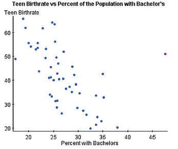
(a) The least-squares regression with Washington, DC, included is yn = -1.2688 x + 76.0284. The least-squares regression line with Washington, DC, excluded is yn = -1.9465 x + 93.4464. Do you think the point corresponding to Washington, DC, may be influential? Why?
(b) Washington, DC, often appears as an influential observation in regression analysis. What is it about Washington, DC, that makes it influential?
(c) Would you say that higher levels of education cause lower teen birthrates?
Step by Step Answer:
a Yes the point corresponding to Washington DC is influential becaus...View the full answer


Statistics Informed Decisions Using Data
ISBN: 9780321757272
4th Edition
Authors: Michael Sullivan III
