

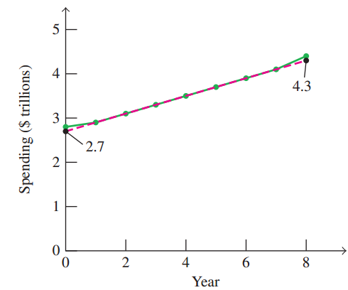
The green graph shows healthcare spending, in trillions of dollars, in the United States for the years
Question:
(a) Determine the slope of the red dashed line.
(b) Determine the equation of the red dashed line, using (0, 2.7) as the y-intercept.
(c) Using the equation you determined in part (b), est-mate the projected healthcare spending in the United States in 2017. $3.7 trillion
(d) Using the equation you determined in part (b), determine the year in which healthcare spending in the United States is projected to be $3.9 trillion.
Health Spending in the United States
Fantastic news! We've Found the answer you've been seeking!
Step by Step Answer:
a Slope 43 278 0 169 02 b y ...View the full answer

Answered By
Nandana Wijayarathna
I am a highly experienced writer in several areas,
Business management
Information technology
Business administration
Literature
Biology
Environmental science
History
161+ Reviews
399+ Question Solved
Related Book For 

A Survey of Mathematics with Applications
ISBN: 978-0134112107
10th edition
Authors: Allen R. Angel, Christine D. Abbott, Dennis Runde
Question Posted:
