

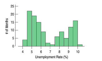
The histogram shows the monthly U.S. unemployment rate from January 2003 to January 2013 (data.bls.gov/timeseries/LNS14000000). Here is
Question:
The histogram shows the monthly U.S. unemployment rate from January 2003 to January 2013 (data.bls.gov/timeseries/LNS14000000).
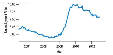
Here is the time series plot for the same data.
a) What features of the data can you see in the histogram that aren€™t clear in the time series plot?
b) What features of the data can you see in the time series plot that aren€™t clear in the histogram?
c) Which graphical display seems the more appropriate for these data? Explain.
d) Write a brief description of unemployment rates over this time period in the United States.
Fantastic news! We've Found the answer you've been seeking!
Step by Step Answer:
a The histogram shows that the distribution is bimodal b The trend over time c T...View the full answer

Answered By
Akshay Singla
as a qualified engineering expert i am able to offer you my extensive knowledge with real solutions in regards to planning and practices in this field. i am able to assist you from the beginning of your projects, quizzes, exams, reports, etc. i provide detailed and accurate solutions.
i have solved many difficult problems and their results are extremely good and satisfactory.
i am an expert who can provide assistance in task of all topics from basic level to advance research level. i am working as a part time lecturer at university level in renowned institute. i usually design the coursework in my specified topics. i have an experience of more than 5 years in research.
i have been awarded with the state awards in doing research in the fields of science and technology.
recently i have built the prototype of a plane which is carefully made after analyzing all the laws and principles involved in flying and its function.
1. bachelor of technology in mechanical engineering from indian institute of technology (iit)
2. award of excellence in completing course in autocad, engineering drawing, report writing, etc
48+ Reviews
56+ Question Solved
Related Book For 

Business Statistics
ISBN: 9780321925831
3rd Edition
Authors: Norean Sharpe, Richard Veaux, Paul Velleman
Question Posted:
