

1. If someone tells you the mean and SD of a variable, what had you better find...
Question:
2. Another approach to working with skewed data is to remove the extreme values and work with those that remain. Does this approach work? Remove the top 5 or 10 compensations from these salaries. Does the skewness persist? What if you remove more?
3. You will often run into natural logs (logs to base e, sometimes written ln) rather than base-10 logs. These are more similar than you might expect. In particular, what is the association between log10 compensation and loge compensation? What does the strength of the association tell you?
4. Calculate the log10 of net revenue for these companies and find the mean of these values. Then convert the mean back to the scale of dollars by raising 10 to the power of the mean of the logs (take the antilog of the mean of the logs). Is the value you obtain closer to the mean or the median of net sales?
INCOME AND SKEWNESS
The salaries of the chief executive officer, or CEO, of large corporations have become regular news items. Most of these stories describe the salaries of top executives and ignore everyone else. It turns out that there€™s a surprising amount of variation in salaries across different firms, if you know where and how to look.
The data table for this case study has 1,835 rows, one for each chief executive officer at 1,835 companies in the United States. The data table has several columns, but we begin with the most interesting: total compensation. Total compensation combines salary with other bonuses paid to reward the CEO for achievements during the year. Some bonuses are paid as cash, and others come as stock in the company. The histogram in Figure 1 shows the distribution of total compensation, in millions of dollars, in 2010. Does it look like what you expect for data that have a median of +4 million with interquartile range of +6 million?
Table 1
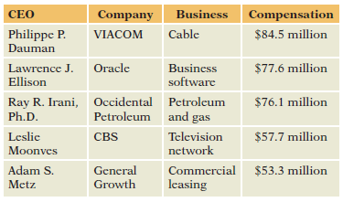
When compared to the earnings of this elite group, the earnings of the remaining CEOs appear downright reasonable. The tallest bar at the far left of the histogram represents CEOs who made less than +2.5 million. That group accounts for about one-third of the cases shown in Figure 1, but we can barely see them in the boxplot because they are squeezed together at the left margin.
The skewness in the histogram affects numerical summaries as well. When data are highly skewed, we have to be very careful interpreting summary statistics such as the mean and standard deviation. Skewed distributions are hard to summarize with one or two statistics. Neither the mean nor the median is a good summary. The boxplot gives the median, but it seems so far to the left. The mean is larger but still to the left of Figure 1 because so many cases accumulate near zero. The median compensation is +4.01 million. The mean is almost half again as large, +6.01 million. The skewness pulls the mean to the right in order to balance the histogram (see Chapter 4).
For some purposes, the mean remains useful. Suppose you had to pay all of these salaries! Which do you need to figure out the total amount of money that it would take to pay all of these: the mean or the median? You need the mean. Because the mean is the sum of all of the compensations divided by the count, +6.01 * 1833 = +11,030 million, about +11 billion, would be needed to pay them all.
Skewness also affects measures of variation. The interquartile range, the length of the box in the boxplot, is +5.9 million. This length is quite a bit smaller than the wide range in salaries. The standard deviation of these data is larger at +6.68 million but still small compared to the range of the histogram. (For data with a bell-shaped distribution, the IQR is usually larger than the standard deviation.)
We should not even think of using the Empirical Rule (Chapter 4). The Empirical Rule describes bell-shaped distributions and gives silly answers for data so skewed as these. When the distribution is bell shaped, we can sketch the histogram if we know the mean and standard deviation. For instance, the interval given by the mean plus or minus one standard deviation holds about two-thirds of the data when the distribution is bell shaped. Imagine using that approach here. The interval from xÌ… - s to xÌ… + s reaches from 6.01 - 6.68 = - $0.67 million to 6.01 + 6.68 = +12.69 million. The lower endpoint of this interval is negative, but negative compensations don€™t happen! Skewness ruins any attempt to use the Empirical Rule to connect x# and s to the histogram.
DistributionThe word "distribution" has several meanings in the financial world, most of them pertaining to the payment of assets from a fund, account, or individual security to an investor or beneficiary. Retirement account distributions are among the most...
Step by Step Answer:
1 Verify the distribution is bellshaped 2 No Skewness remains ...View the full answer


Statistics For Business Decision Making And Analysis
ISBN: 9780134497167
3rd Edition
Authors: Robert A. Stine, Dean Foster
