

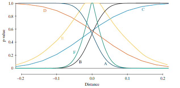
The graph below shows six different curves labeled AF. Each curve shows the relationship between the p-value
Question:
Match each curve A€“F with one of the descriptions:
Sample size is n = 25, alternative hypothesis is right sided: Ï€ > ½.
Sample size is n = 225, alternative hypothesis is right sided: Ï€ > ½.
Sample size is n = 25, alternative hypothesis is left sided: Ï€ < ½.
Sample size is n = 225, alternative hypothesis is left sided: Ï€ < ½.
Sample size is n = 25, alternative hypothesis is two sided: Ï€ ‰ ½.
Sample size is n = 225, alternative hypothesis is two sided: Ï€ ‰ ½.
Comment: This is not an easy exercise, but don€™t let the surface mess of the picture put you off . The purpose of the exercise is to challenge you to think hard about very important issues in a new way and at the same time to challenge you to become more skillful at connecting graphs with ideas. We hope you won€™t give up and that you€™ll feel that what you learn from the time you spend is worth it. Give it a shot, see how far you can get, and if you get stuck, skip to the five exercises that come after the graphs, do those, and then come back to this one.
Fantastic news! We've Found the answer you've been seeking!
Step by Step Answer:
D Sample size is n 25 alternative hypothesis is rightsided A Sample size is ...View the full answer

Answered By
Madhur Jain
I have 6 years of rich teaching experience in subjects like Mathematics, Accounting, and Entrance Exams preparation. With my experience, I am able to quickly adapt to the student's level of understanding and make the best use of his time.
I focus on teaching concepts along with the applications and what separates me is the connection I create with my students. I am well qualified for working on complex problems and reaching out to the solutions in minimal time. I was also awarded 'The Best Tutor Award' for 2 consecutive years in my previous job.
Hoping to get to work on some really interesting problems here.
1+ Reviews
10+ Question Solved
Related Book For 
Introduction To Statistical Investigations
ISBN: 9781118172148
1st Edition
Authors: Beth L.Chance, George W.Cobb, Allan J.Rossman Nathan Tintle, Todd Swanson Soma Roy
Question Posted:
