

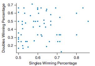
The following graph shows the winning percentages in singles matches and doubles matches for a sample of
Question:
The following graph shows the winning percentages in singles matches and doubles matches for a sample of male professional tennis players.
a. Based on this scatterplot, would you say there is a strong linear association between these two variables?
b. Would the numerical value of the correlation between these two variables be close to negative one, positive one, or zero? Give a reason for your answer.
c. Based on this graph, do you think one can accurately predict a professional tennis player’s doubles winning percentage based on his singles winning percentage?
Fantastic news! We've Found the answer you've been seeking!
Step by Step Answer:
a Based on the scatterplot it appears that there is a positive linear association between the single...View the full answer

Answered By
Joshua Marie Geuvara
I am an academic writer with over 5 years of experience. I write term papers, essays, dissertations, reports, and any other academic paper. My main objective is to produce a high-quality paper free from plagiarism and ensure a student scores an A+. Being a fluent English speaker, I have great communication skills that also enable me to produce excellent papers.
I am conversant with most academic referencing styles (APA, MLA, and Harvard).
You can trust me with your paper and expect nothing less than quality and excellent results. I look forward to meeting with you and, more importantly, developing something that will both make us happy and satisfied.
0 Reviews
10+ Question Solved
Related Book For 
Introductory Statistics Exploring The World Through Data
ISBN: 9780135163146
3rd Edition
Authors: Robert Gould, Rebecca Wong, Colleen N. Ryan
Question Posted:
