Each March, the Bureau of Labor Statistics compiles an Annual Demographic Supplement to its monthly Current Population
Question:
Each March, the Bureau of Labor Statistics compiles an Annual Demographic Supplement to its monthly Current Population Survey. Data on about 71,067 individuals between the ages of 25 and 64 who were employed full-time were collected in one of these surveys. The parallel boxplots compare the distributions of income for people with five levels of education. This figure is a variation of the boxplot idea: because large data sets often contain very extreme observations, we omitted the individuals in each category with the top 5% and bottom 5% of incomes. Also, the whiskers are drawn all the way to the maximum and minimum values of the remaining data for each distribution.
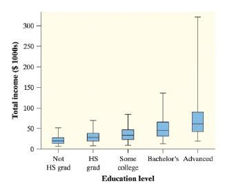
Use the graph to help answer the following questions.
a. What shape do the distributions of income have?
b. Explain how you know that there are outliers in the group that earned an advanced degree.
c. How does the typical income change as the highest education level reached increases? Why does this make sense?
d. Describe how the variability in income changes as the highest education level reached increases.
Step by Step Answer:
catter plot If anything the relationship may be linear with a slightly negative slope bThe maximum i...View the full answer