

The figure is a cumulative relative frequency graph of the amount spent by 50 consecutive grocery shoppers
Question:
The figure is a cumulative relative frequency graph of the amount spent by 50 consecutive grocery shoppers at a store.
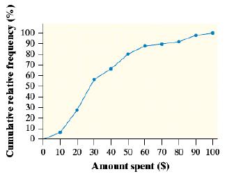
a. Estimate the interquartile range (IQR) of this distribution. Show your method.
b. What is the percentile for the shopper who spent $19.50?
c. Explain why the graph is steepest between $10 and $30.
d. Draw the histogram that corresponds to this graph.
Fantastic news! We've Found the answer you've been seeking!
Step by Step Answer:
a Q1 19 Q4 44 44 19 25 b ...View the full answer

Answered By
Atuga Nichasius
Hello, I am Atuga an Electronics and Electrical Engineer by profession. I have a lot of experience with electronics and computer science. Through the years I have a tutor professionally for three years in a teachers' training institute. Looking forward to apply my skills here.
0 Reviews
10+ Question Solved
Related Book For 
Question Posted:
