

This is an example of a poorly designed dashboard. It displays key performance measures of a fictitious
Fantastic news! We've Found the answer you've been seeking!
Question:
This is an example of a poorly designed dashboard. It displays key performance measures of a fictitious company. Various sales and profit measures are shown.?
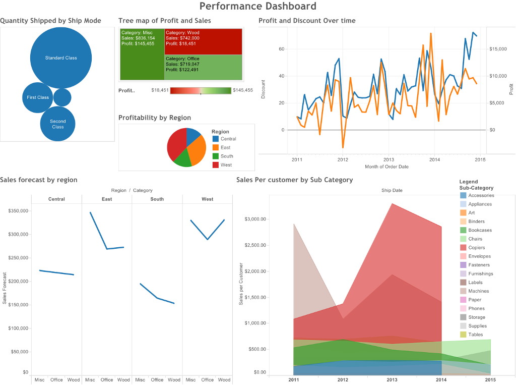
Comment on what does not work well in this dashboard, how to improve the design of the dashboard, choice of charts and the ability of this dashboard to communicate a story effectively.
Expert Answer:

Related Book For 

Posted Date:
