Figure 3.35 shows the median home prices in regions of the United States. How is the graph
Question:
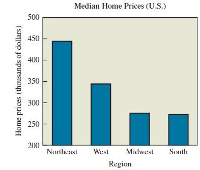
Figure 3.35 shows the median home prices in regions of the United States. How is the graph misleading? How could it be drawn so that it is not misleading?

Transcribed Image Text:
Median Home Prices (U.S.) 500 450 400 350 300 250 200 Northeast West Midwest South Region Home prices (thousands of dollars)
Fantastic news! We've Found the answer you've been seeking!
Step by Step Answer:
Answer rating: 75% (8 reviews)
The graph is misleading because the aggregate data is not a representative s...View the full answer

Answered By

Labindao Antoque
I graduated in 2018 with a Bachelor of Science degree in Psychology from Dalubhasaan ng Lungsod ng San Pablo. I tutored students in classes and out of classes. I use a variety of strategies to tutor students that include: lecture, discussions about the subject matter, problem solving examples using the principles of the subject matter being discussed in class , homework assignments that are directed towards reinforcing what we learn in class , and detailed practice problems help students to master a concept. I also do thorough research on Internet resources or textbooks so that I know what students need to learn in order to master what is being taught in class .
0.00
0 Reviews
10+ Question Solved
Related Book For 

Statistical Reasoning For Everyday Life
ISBN: 978-0134494043
5th Edition
Authors: Jeff Bennett, William Briggs, Mario Triola
Question Posted:
Students also viewed these Sciences questions
-
In Figure 12.5, let regions 2 and 3 both be of quarter-wave thickness. Region 4 is glass, having refractive index, n 4 = 1.45; region 1 is air.
-
In 2011, home prices and mortgage rates dropped so low that in a number of cities the monthly cost of owning a home was less than renting. The following data show the average asking rent for 10...
-
In 2011, home prices and mortgage rates fell so far that in a number of cities the monthly cost of owning a home was less expensive than renting. The following data show the average asking rent for...
-
6 Question 9 of 11 View Policies Cash Receivables Inventories Current Attempt in Progress On January 1, 2024, Novak Company acquired all the assets and assumed all the liabilities of Crane Company...
-
Which interest rate would you prefer to pay on a loan: 9% compounded monthly, 9.1% compounded quarterly, 9.2% compounded semiannually, or 9.3% compounded annually?
-
The following is a list of accounts taken from Jim's Uniforms: Accounts receivable 18,000 Sales Inventory 3,150 Accounts payable . 4,620 Cash .. 7,330 Prepaid insurance .. 2,800 Equipment...
-
Using the following criteria, specify the differences between each form of legal business organization: (a) number of owners, (b) liability for firms debts, (c) change in ownership and/or dissolution...
-
John Thomas. the owner of Thomas Testing, has done some contract work for insurance companies regarding drunk driving_ To Improve his research capabilities, he recently purchased the Rupple Driving...
-
Explain why clients may want to have a review, versus an audit. In detail, explain the differences between a certified audit and a review. In addition, what role does an internal auditor play in...
-
Refer to earlier chapters for the functional details of this application. Large delivery companies like UPS and FedEx use highly customized portable hardware devices to enable their drivers to track...
-
What are the lowest and highest possible pulse rates that could be included in the frequency table? Most Appropriate Display. Exercises describe data sets but do not give actual data. For each data...
-
Are there any locations that stand out as unusual and that might therefore warrant special study? Explain Melanoma Mortality. For Exercises, refer to Figure 3.26, which shows the female mortality...
-
The table gives the numbers of passenger car occupants killed in accidents in 2011 by car type. Convert this table to a relative frequency table. Subcompact and Mini Compact Intermediate Full Unknown...
-
What is the present value of the following future receipts? a. $19,000 five years from now at 9 percent compounded annually b. $8,300 twelve years from now at 15 percent compounded annually c. $6,200...
-
A subsidiary of a major furniture company manufactures wooden pallets. The plant has the capacity to produce 300,000 pallets per year. Presently, the plant is operating at 70 percent of capacity. The...
-
True of False: Ifmoneyisworth6%compoundedannually to you, then you should prefer toreceive\($1750\)peryearfor5yearsthantoreceive\($1000\)peryear for10years,assuming the first receipt occurs one year...
-
An antenna analyzer for checking resonant frequency, impedance, and even feed line characteristics over 1 MHz to 170MHz can be produced by either of two processing sequences, S1 or S2. Sequence S1...
-
Deposits are made at the end of years 1 through 7 into an account paying 5 percent per year interest. The deposits start at $4,000 and increase by 15 percent each year. How much will be in the...
-
Why should a manager try to assess the probabilities associated with possible outcomes before making a decision under conditions of uncertainty?
-
What steps must a business take to implement a program of social responsibility?
-
An ideal gas undergoes an adiabatic expansion into a vacuum. Are S, S surroundings , and S total positive, negative, or zero? Explain your reasoning.
-
Propose a plausible synthesis for each of the following transformations. a. b. c. d. H.
-
When a saturated solution of a salt is cooled, a precipitate crystallizes out. Is the entropy of the crystalline precipitate greater or less than the dissolved solute? Explain why this process is...
-
Determine in each situation when capital investment analysis would be used. Purchase of a new delivery truck, which has an estimated useful life of five yearsDetermine if each statement would relate...
-
Suppose: Your gross salary is currently 45K annually. Your boss offers you to switch to a market-based contract: $30 K if the market is down or $80 K if the market is up, the market is equally likely...
-
What is the correlation between stocks X and Z? State of the Economy Probability of Occurrence Stock X Expected Return Stock Y Expected Return Stock Z Expected Return Recession 35% 25% -10% 15%...

Study smarter with the SolutionInn App


