

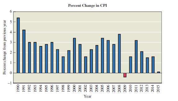
The graph in Figure 3.39 shows the percentage change in the Consumer Price Index (CPI) over recent
Question:
The graph in Figure 3.39 shows the percentage change in the Consumer Price Index (CPI) over recent years. In what year (of the years displayed) was the change in the CPI the greatest? What happened in 2009? How did actual prices in 2015 compare to those in 1990? Based on this graph, what can you conclude about changes in prices during the period shown?
Fantastic news! We've Found the answer you've been seeking!
Step by Step Answer:
The graph in Figure 339 shows the percentage change in the Consumer Price Index CPI over recent year...View the full answer

Answered By
Labindao Antoque
I graduated in 2018 with a Bachelor of Science degree in Psychology from Dalubhasaan ng Lungsod ng San Pablo. I tutored students in classes and out of classes. I use a variety of strategies to tutor students that include: lecture, discussions about the subject matter, problem solving examples using the principles of the subject matter being discussed in class , homework assignments that are directed towards reinforcing what we learn in class , and detailed practice problems help students to master a concept. I also do thorough research on Internet resources or textbooks so that I know what students need to learn in order to master what is being taught in class .
0 Reviews
10+ Question Solved
Related Book For 
Statistical Reasoning For Everyday Life
ISBN: 978-0134494043
5th Edition
Authors: Jeff Bennett, William Briggs, Mario Triola
Question Posted:
