

The graph in Figure 3.40 on the next page shows data regarding the relative risk of schizophrenia
Question:
The graph in Figure 3.40 on the next page shows data regarding the relative risk of schizophrenia among people born in different months.
a. Note that the scale of the vertical axis does not start at zero. What would be the effect of sketching the same risk curve using an axis that starts at zero?
b. Each value of the relative risk is shown with a dot at its most likely value and with an “error bar” indicating the range in which the data value probably lies. The study concludes that “the risk was also significantly associated with the season of birth.” Given the size of the error bars, does this claim appear justified? (Is it possible to draw a flat line that passes through all of the error bars?)
Figure 3.40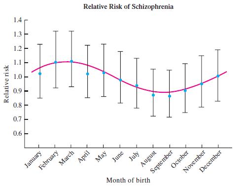
Step by Step Answer:
a If the scale of the vertical axis starts at zero it would be easier to visualize the difference be...View the full answer


Statistical Reasoning For Everyday Life
ISBN: 978-0134494043
5th Edition
Authors: Jeff Bennett, William Briggs, Mario Triola
