

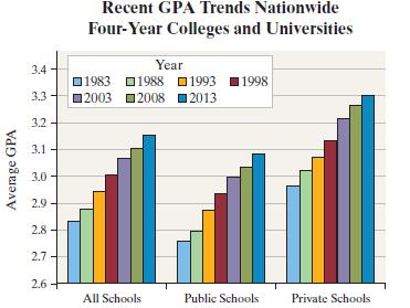
The side-by-side bar graph to the right shows the average grade point average for the academic years
Question:
The side-by-side bar graph to the right shows the average grade point average for the academic years beginning in 1983, 1988, 1993, 1998, 2003, 2008, and 2013, for colleges and universities.
(a) Does the graph suggest that grade inflation is a problem in colleges?
(b) In 1998, a grade of A became the most popular grade nationwide. Determine the percentage increase in GPAs for public schools from 1998 (2.92) to 2013 (3.07). Determine the percentage increase in GPAs for private schools from 1998 (3.11) to 2013 (3.30). Which type of institution appears to have the higher inflation?
(c) Do you believe the graph is misleading? Explain
Fantastic news! We've Found the answer you've been seeking!
Step by Step Answer:
a Yes Grade inflation seems to be happening in colleges GPAs have increase...View the full answer

Answered By
Utsab mitra
I have the expertise to deliver these subjects to college and higher-level students. The services would involve only solving assignments, homework help, and others.
I have experience in delivering these subjects for the last 6 years on a freelancing basis in different companies around the globe. I am CMA certified and CGMA UK. I have professional experience of 18 years in the industry involved in the manufacturing company and IT implementation experience of over 12 years.
I have delivered this help to students effortlessly, which is essential to give the students a good grade in their studies.
2+ Reviews
10+ Question Solved
Related Book For 
Question Posted:
