

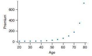
The graph shows the monthly premiums for a 10-year $250,000 male life insurance policy by age of
Question:
The graph shows the monthly premiums for a 10-year $250,000 male life insurance policy by age of purchase. For example, a 20-year-old male could purchase such a policy for about $10 per month, while a 50-year-old male would pay about $24 per month for the same policy.
a. Explain what the graph tells us about life insurance rates for males at different ages. Explain why life insurance rates might follow this trend.
b. Would it be appropriate to do a linear regression analysis on these data? Why or why not?
Fantastic news! We've Found the answer you've been seeking!
Step by Step Answer:
a The graph shows that the monthly premiums for a 10year 250000 male life insurance polic...View the full answer

Answered By
Nikka Ella Clavecillas Udaundo
I have a degree in psychology from Moi University, and I have experience working as a tutor for students in both psychology and other subjects. I am passionate about helping students learn and reach their potential, and I firmly believe that everyone has the ability to succeed if they receive the right support and guidance. I am patient and adaptable, and I will work with each individual student to tailor my teaching methods to their needs and learning style. I am confident in my ability to help students improve their grades and reach their academic goals, and I am excited to work with a new group of students.
0 Reviews
10+ Question Solved
Related Book For 
Introductory Statistics Exploring The World Through Data
ISBN: 9780135163146
3rd Edition
Authors: Robert Gould, Rebecca Wong, Colleen N. Ryan
Question Posted:
