

Consider the graph shown in Figure 14.12. Figure 14. 12 a. How many types of payments are
Question:
Consider the graph shown in Figure 14.12.
Figure 14.12
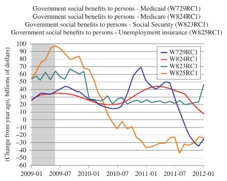
a. How many types of payments are tracked? Can you think of any other payments that might have been included? If so, why do you think they have not been included?
b. In January 2009 the red and blue graphs seem to be about 25 on the vertical scale. What does this number represent?
c. Late in 2010 one curve crosses -20 on the vertical scale. What does this represent?
d. In which year(s) were the various networks tracked?
e. Which payments had the highest (and when) change from the previous year?
Fantastic news! We've Found the answer you've been seeking!
Step by Step Answer:
Based on the graph provided a The graph tracks four types of payments which are related to governmen...View the full answer

Answered By
S Mwaura
A quality-driven writer with special technical skills and vast experience in various disciplines. A plagiarism-free paper and impeccable quality content are what I deliver. Timely delivery and originality are guaranteed. Kindly allow me to do any work for you and I guarantee you an A-worthy paper.
27+ Reviews
73+ Question Solved
Related Book For 

Question Posted:
