

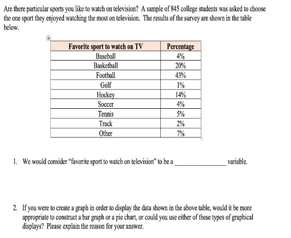
Are there particular sports you like to watch on television? A sample of 845 college students...
Fantastic news! We've Found the answer you've been seeking!
Question:
Transcribed Image Text:
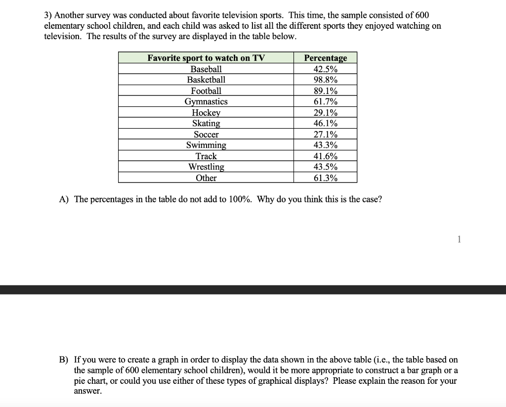
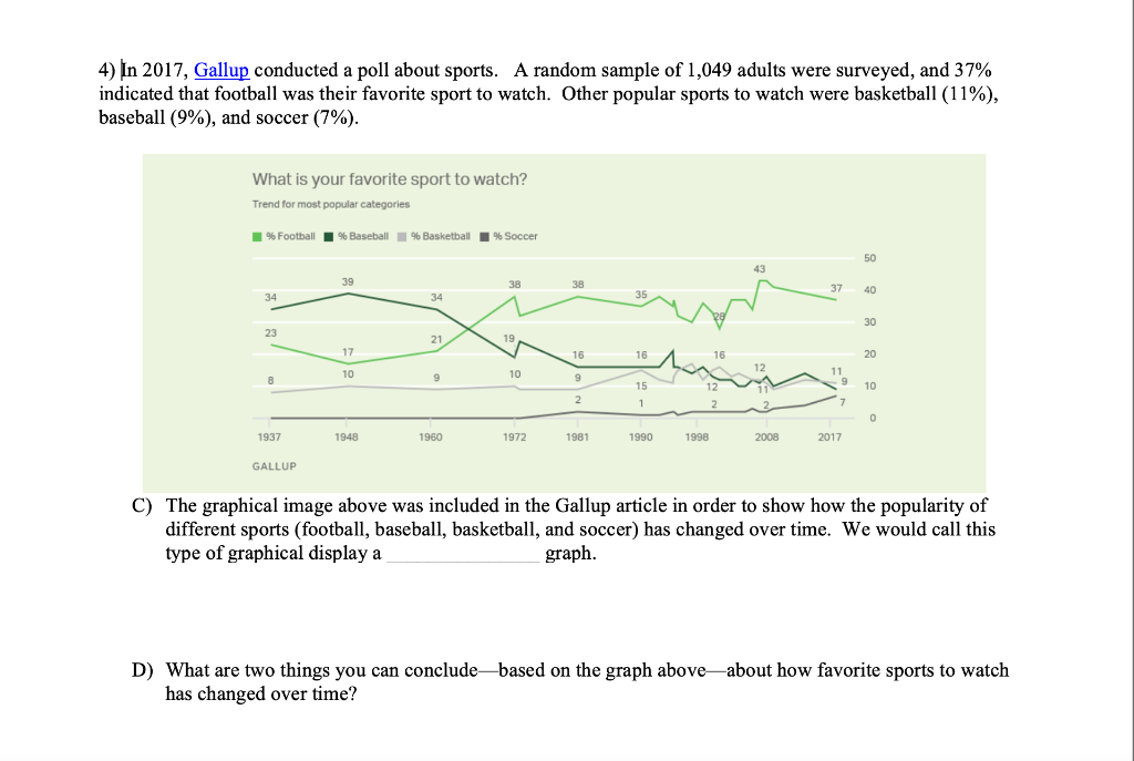
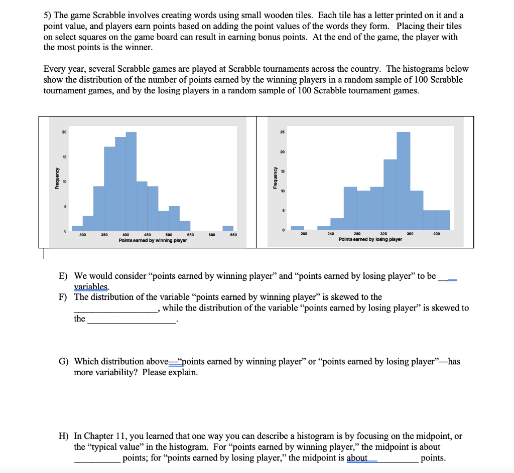
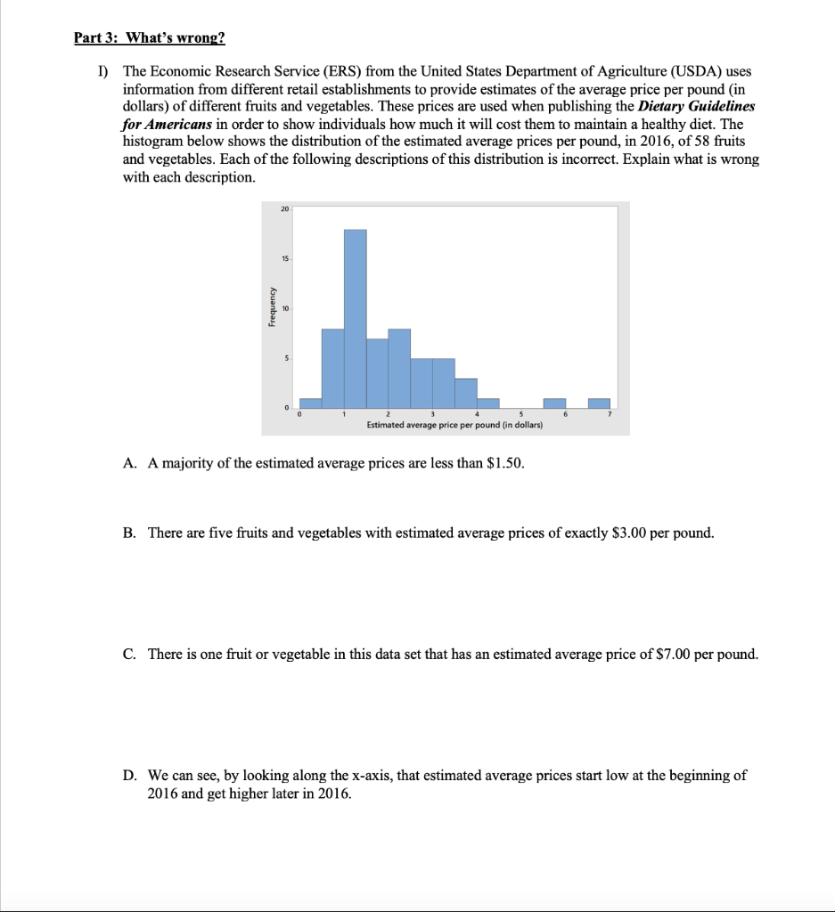
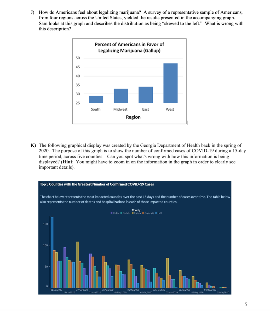
Are there particular sports you like to watch on television? A sample of 845 college students was asked to choose the one sport they enjoyed watching the most on television. The results of the survey are shown in the table below. Favorite sport to watch on TV Baseball Basketball Football Golf Hockey Soccer Tennis Track Other Percentage 4% 20% 43% 1% 14% 4% 5% 2% 7% 1. We would consider "favorite sport to watch on television" to be a_ variable. 2. If you were to create a graph in order to display the data shown in the above table, would it be more appropriate to construct a bar graph or a pie chart, or could you use either of these types of graphical displays? Please explain the reason for your answer. 3) Another survey was conducted about favorite television sports. This time, the sample consisted of 600 elementary school children, and each child was asked to list all the different sports they enjoyed watching on television. The results of the survey are displayed in the table below. Percentage 42.5% 98.8% Favorite sport to watch on TV Baseball Basketball Football Gymnastics Hockey Skating Soccer Swimming Track Wrestling Other A) The percentages in the table do not add to 100%. Why do you think this is the case? 89.1% 61.7% 29.1% 46.1% 27.1% 43.3% 41.6% 43.5% 61.3% 1 B) If you were to create a graph in order to display the data shown in the above table (i.e., the table based on the sample of 600 elementary school children), would it be more appropriate to construct a bar graph or a pie chart, or could you use either of these types of graphical displays? Please explain the reason for your answer. 4) In 2017, Gallup conducted a poll about sports. A random sample of 1,049 adults were surveyed, and 37% indicated that football was their favorite sport to watch. Other popular sports to watch were basketball (11%), baseball (9%), and soccer (7%). What is your favorite sport to watch? Trend for most popular categories % Football 34 23 8 1937 GALLUP % Baseball % Basketball % Soccer 39 17 10 1948 34 21 9 1960 38 19 10 1972 38 16 9 2 1981 35 16 15 1 1990 16 12 2 1998 12 2008 37 11 7 2017 50 40 30 20 10 0 C) The graphical image above was included in the Gallup article in order to show how the popularity of different sports (football, baseball, basketball, and soccer) has changed over time. We would call this type of graphical display a graph. D) What are two things you can conclude-based on the graph above about how favorite sports to watch has changed over time? 5) The game Scrabble involves creating words using small wooden tiles. Each tile has a letter printed on it and a point value, and players earn points based on adding the point values of the words they form. Placing their tiles on select squares on the game board can result in earning bonus points. At the end of the game, the player with the most points is the winner. Every year, several Scrabble games are played at Scrabble tournaments across the country. The histograms below show the distribution of the number of points earned by the winning players in a random sample of 100 Scrabble tournament games, and by the losing players in a random sample of 100 Scrabble tournament games. Frequency 350 400 450 500 Points earned by winning player the 550 600 650 200 240 280 320 Points earned by losing player E) We would consider "points earned by winning player" and "points earned by losing player" to be variables. F) The distribution of the variable "points earned by winning player" is skewed to the 360 while the distribution of the variable "points earned by losing player" is skewed to G) Which distribution above "points earned by winning player" or "points earned by losing player" has more variability? Please explain. H) In Chapter 11, you learned that one way you can describe a histogram is by focusing on the midpoint, or the "typical value" in the histogram. For "points earned by winning player," the midpoint is about points; for "points earned by losing player," the midpoint is about points. Part 3: What's wrong? I) The Economic Research Service (ERS) from the United States Department of Agriculture (USDA) uses information from different retail establishments to provide estimates of the average price per pound (in dollars) of different fruits and vegetables. These prices are used when publishing the Dietary Guidelines for Americans in order to show individuals how much it will cost them to maintain a healthy diet. The histogram below shows the distribution of the estimated average prices per pound, in 2016, of 58 fruits and vegetables. Each of the following descriptions of this distribution is incorrect. Explain what is wrong with each description. 20 Estimated average price per pound (in dollars) A. A majority of the estimated average prices are less than $1.50. B. There are five fruits and vegetables with estimated average prices of exactly $3.00 per pound. C. There is one fruit or vegetable in this data set that has an estimated average price of $7.00 per pound. D. We can see, by looking along the x-axis, that estimated average prices start low at the beginning of 2016 and get higher later in 2016. J) How do Americans feel about legalizing marijuana? A survey of a representative sample of Americans, from four regions across the United States, yielded the results presented in the accompanying graph. Sam looks at this graph and describes the distribution as being "skewed to the left." What is wrong with this description? 150 100- 50- 50 0 45 28Apr2020 40 27Apr2020 35 30 25 K) The following graphical display was created by the Georgia Department of Health back in the spring of 2020. The purpose of this graph is to show the number of confirmed cases of COVID-19 during a 15-day time period, across five counties. Can you spot what's wrong with how this information is being displayed? (Hint: You might have to zoom in on the information in the graph in order to clearly see important details). Top 5 Counties with the Greatest Number of Confirmed COVID-19 Cases Percent of Americans in Favor of Legalizing Marijuana (Gallup) South The chart below represents the most impacted counties over the past 15 days and the number of cases over time. The table below also represents the number of deaths and hospitalizations in each of those impacted counties. 29 Apr2020 Midwest Region 01May2020 East 30Apr2020 County Cobb DeKalb Fulton Gwinnett Hall 04May2020 06May2020 West 05May2020 02May2020 07May2020 26Apr2020 03May2020 08May2020 09May2020 5 Are there particular sports you like to watch on television? A sample of 845 college students was asked to choose the one sport they enjoyed watching the most on television. The results of the survey are shown in the table below. Favorite sport to watch on TV Baseball Basketball Football Golf Hockey Soccer Tennis Track Other Percentage 4% 20% 43% 1% 14% 4% 5% 2% 7% 1. We would consider "favorite sport to watch on television" to be a_ variable. 2. If you were to create a graph in order to display the data shown in the above table, would it be more appropriate to construct a bar graph or a pie chart, or could you use either of these types of graphical displays? Please explain the reason for your answer. 3) Another survey was conducted about favorite television sports. This time, the sample consisted of 600 elementary school children, and each child was asked to list all the different sports they enjoyed watching on television. The results of the survey are displayed in the table below. Percentage 42.5% 98.8% Favorite sport to watch on TV Baseball Basketball Football Gymnastics Hockey Skating Soccer Swimming Track Wrestling Other A) The percentages in the table do not add to 100%. Why do you think this is the case? 89.1% 61.7% 29.1% 46.1% 27.1% 43.3% 41.6% 43.5% 61.3% 1 B) If you were to create a graph in order to display the data shown in the above table (i.e., the table based on the sample of 600 elementary school children), would it be more appropriate to construct a bar graph or a pie chart, or could you use either of these types of graphical displays? Please explain the reason for your answer. 4) In 2017, Gallup conducted a poll about sports. A random sample of 1,049 adults were surveyed, and 37% indicated that football was their favorite sport to watch. Other popular sports to watch were basketball (11%), baseball (9%), and soccer (7%). What is your favorite sport to watch? Trend for most popular categories % Football 34 23 8 1937 GALLUP % Baseball % Basketball % Soccer 39 17 10 1948 34 21 9 1960 38 19 10 1972 38 16 9 2 1981 35 16 15 1 1990 16 12 2 1998 12 2008 37 11 7 2017 50 40 30 20 10 0 C) The graphical image above was included in the Gallup article in order to show how the popularity of different sports (football, baseball, basketball, and soccer) has changed over time. We would call this type of graphical display a graph. D) What are two things you can conclude-based on the graph above about how favorite sports to watch has changed over time? 5) The game Scrabble involves creating words using small wooden tiles. Each tile has a letter printed on it and a point value, and players earn points based on adding the point values of the words they form. Placing their tiles on select squares on the game board can result in earning bonus points. At the end of the game, the player with the most points is the winner. Every year, several Scrabble games are played at Scrabble tournaments across the country. The histograms below show the distribution of the number of points earned by the winning players in a random sample of 100 Scrabble tournament games, and by the losing players in a random sample of 100 Scrabble tournament games. Frequency 350 400 450 500 Points earned by winning player the 550 600 650 200 240 280 320 Points earned by losing player E) We would consider "points earned by winning player" and "points earned by losing player" to be variables. F) The distribution of the variable "points earned by winning player" is skewed to the 360 while the distribution of the variable "points earned by losing player" is skewed to G) Which distribution above "points earned by winning player" or "points earned by losing player" has more variability? Please explain. H) In Chapter 11, you learned that one way you can describe a histogram is by focusing on the midpoint, or the "typical value" in the histogram. For "points earned by winning player," the midpoint is about points; for "points earned by losing player," the midpoint is about points. Part 3: What's wrong? I) The Economic Research Service (ERS) from the United States Department of Agriculture (USDA) uses information from different retail establishments to provide estimates of the average price per pound (in dollars) of different fruits and vegetables. These prices are used when publishing the Dietary Guidelines for Americans in order to show individuals how much it will cost them to maintain a healthy diet. The histogram below shows the distribution of the estimated average prices per pound, in 2016, of 58 fruits and vegetables. Each of the following descriptions of this distribution is incorrect. Explain what is wrong with each description. 20 Estimated average price per pound (in dollars) A. A majority of the estimated average prices are less than $1.50. B. There are five fruits and vegetables with estimated average prices of exactly $3.00 per pound. C. There is one fruit or vegetable in this data set that has an estimated average price of $7.00 per pound. D. We can see, by looking along the x-axis, that estimated average prices start low at the beginning of 2016 and get higher later in 2016. J) How do Americans feel about legalizing marijuana? A survey of a representative sample of Americans, from four regions across the United States, yielded the results presented in the accompanying graph. Sam looks at this graph and describes the distribution as being "skewed to the left." What is wrong with this description? 150 100- 50- 50 0 45 28Apr2020 40 27Apr2020 35 30 25 K) The following graphical display was created by the Georgia Department of Health back in the spring of 2020. The purpose of this graph is to show the number of confirmed cases of COVID-19 during a 15-day time period, across five counties. Can you spot what's wrong with how this information is being displayed? (Hint: You might have to zoom in on the information in the graph in order to clearly see important details). Top 5 Counties with the Greatest Number of Confirmed COVID-19 Cases Percent of Americans in Favor of Legalizing Marijuana (Gallup) South The chart below represents the most impacted counties over the past 15 days and the number of cases over time. The table below also represents the number of deaths and hospitalizations in each of those impacted counties. 29 Apr2020 Midwest Region 01May2020 East 30Apr2020 County Cobb DeKalb Fulton Gwinnett Hall 04May2020 06May2020 West 05May2020 02May2020 07May2020 26Apr2020 03May2020 08May2020 09May2020 5
Expert Answer:
Answer rating: 100% (QA)
Answer 1 Part 1 We would consider favourite sport to be watch on television to be discrete random va... View the full answer

Related Book For 

Statistics For Business And Economics
ISBN: 9780134506593
13th Edition
Authors: James T. McClave, P. George Benson, Terry Sincich
Posted Date:
Students also viewed these mathematics questions
-
A random sample of 174 college students was asked to indicate the number of hours per week that they surf the Internet for either personal information or material for a class assignment. The sample...
-
A random sample of 400 college students was asked if college athletes should be paid. The following table gives a two-way classification of the responses. a. If one student is randomly selected from...
-
A random sample of 400 college students was asked to rate two potential designs for the new Student Centre on campus. Of these, 27 rated the designs equally. Of the remainder, 207 gave a higher...
-
A six-lane freeway (three lanes in each direction) in a scenic area has a measured free-flow speed of 88.5 km/h. The peak-hour factor is 0.80, and there are 8% large trucks and buses and 6%...
-
Identify a business venture that you believe could be successful using only Internet commerce. Explain how you would design your Web page, how you would capture business event data, and the mode of...
-
Verify that the Pauli-Dirac representation (14.43) satisfies Eq. (14.27). Data from Eq. 14.27 Data from Eq. 14.43 {,} = + = 2
-
Plaintiff visited South Chicago on January 10, 2008, seeking a new 2008 Nissan Versa (Versa) with manual transmission, anti-lock brakes, and other features. He was told by the employees of South...
-
R.K. Maroon (RKM) is a seed-stage, Web-oriented entertainment company with important intellectual property. RKMs founders, all technology experts in the relevant area, are anticipating a quick leap...
-
By using your own words, describe Online Analytical Processing and what are the implementation techniques.?
-
Early in its fiscal year ending December 31, 2024, San Antonio Outfitters finalized plans to expand operations. The first stage was completed on March 28 with the purchase of a tract of land on the...
-
Analyze and discuss when earnings management may be an ethical practice and when it is an unethical practice.
-
A small sphere, with initial temperature \(T\), is immersed in an ideal Boltzmannian gas at temperature \(T_{0}\). Assuming that the molecules incident on the sphere are first absorbed and then...
-
Calculate the contribution of the first excited electronic state, namely \({ }^{1} \Delta\) with \(g_{e}=2\), of the \(\mathrm{O}_{2}\) molecule toward the Helmholtz free energy and the specific heat...
-
By considering the order of magnitude of the occupation numbers \(\left\langle n_{\varepsilon}ightangle\), show that it makes no difference to the final results of Section 7.1 if we combine a finite...
-
Last year, Miley decided to terminate the S corporation election of her solely owned corporation on October 17, 2018 (effective immediately), in preparation for taking it public. At the time of the...
-
In the data set on wolf upper jaws (Practice Problem 6), each measurement was actually the average of two measurements made on the left and right sides of the jaw of an individual wolf. Thus, a total...
-
Customers send in sales orders to the company's sales department. The sales order clerk reviews the orders for accuracy and then these sales orders are forwarded to data entry. The data entry clerk...
-
What mass of KBr (in grams) should you use to make 350.0 mL of a 1.30 M KBr solution?
-
A team of consultants working for a large national supermarket chain based in the New York metropolitan area developed a statistical model for predicting the annual sales of potential new store...
-
As part of a study on income tax compliance (Behavioral Research and Accounting, January 2015), researchers found that 37% of adult workers prepare their own tax return. Assume that this percentage...
-
The National Center for Education Statistics (NCES) conducted a survey on the condition of America's public school facilities. The survey revealed the following information. The probability that a...
-
For the finite square well potential, prove the formula for the transmission coefficient (7.83), calculate \(R\), and prove that \(|R|^{2}+T=1\). Equation 7.83:- T = |S|2 K3 = 42 2(+)2 cos KL + (2 +...
-
Consider an asymmetric potential barrier, with Calculate the tunneling probability \(T\) for energy \(U_{1} U_{0}\). 0, x < 0 U(x) = U> U, 0 < x 0, x > L. (7.96)
-
The data in Table 1 represent the first exam score of 10 students enrolled in Introductory Statistics. Treat the 10 students as a population. (a) Compute the population mean. (b) Find a simple random...

Study smarter with the SolutionInn App