

Use the sample data from Table 5.1 to create a frequency chart that illustrates the percentage of
Question:
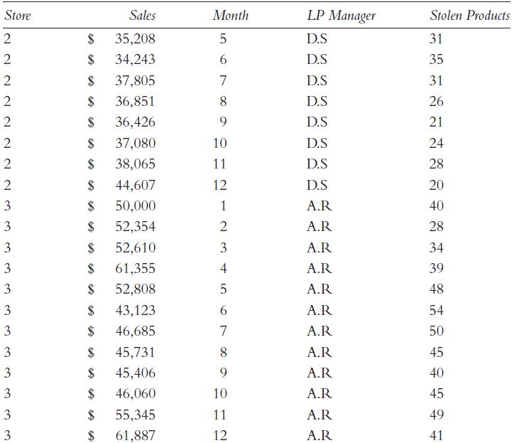
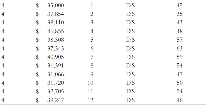
Use the sample data from Table 5.1 to create a frequency chart that illustrates the percentage of sales accounted for by month. Create the chart in Excel and SPSS.
Table 5.1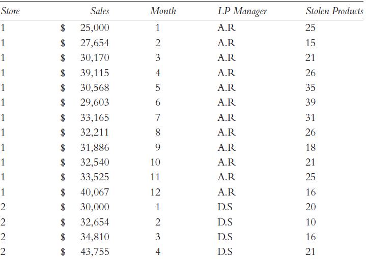
Fantastic news! We've Found the answer you've been seeking!
Step by Step Answer:

Answered By
Mamba Dedan
I am a computer scientist specializing in database management, OS, networking, and software development. I have a knack for database work, Operating systems, networking, and programming, I can give you the best solution on this without any hesitation. I have a knack in software development with key skills in UML diagrams, storyboarding, code development, software testing and implementation on several platforms.
63+ Reviews
152+ Question Solved
Related Book For 

Essentials Of Modeling And Analytics Retail Risk Management And Asset Protection
ISBN: 9780367878801
1st Edition
Authors: David B. Speights, Daniel M. Downs, Adi Raz
Question Posted:
