

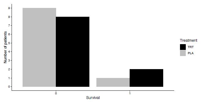
Figure 2.3 displays the frequency distribution from Example 2.5. Create a similar plot using ggplot () to
Question:
Figure 2.3 displays the frequency distribution from Example 2.5. Create a similar plot using ggplot () to display the relative frequency distribution for each treatment group instead of the frequency distribution. (geom_bar(aes $(y=$. prop.., group $=$ trt $)$ ) constructs bars with the relative frequency distribution for each trt group.)
Data from Figure 2.3
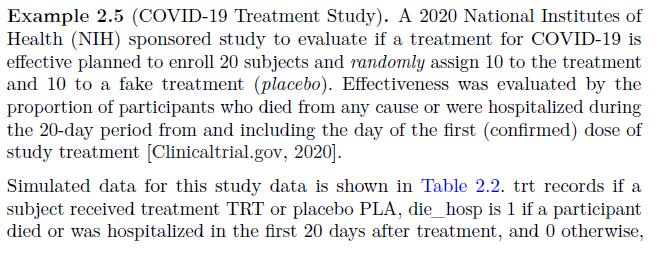
Data from Example 2.5
Step by Step Answer:

This question has not been answered yet.
You can Ask your question!
Related Book For 
Design And Analysis Of Experiments And Observational Studies Using R
ISBN: 9780367456856
1st Edition
Authors: Nathan Taback
Question Posted:
