

The warm temperatures of spring and summer arrive earlier now at high latitudes than they did in
Question:
The warm temperatures of spring and summer arrive earlier now at high latitudes than they did in the past, as a result of human-caused climate change. One consequence is that many organisms start breeding earlier in the year than in previous years, often at suboptimal times. For example, historically the great tit Parus major (a well-studied European bird; see Example 2.3A) laid its eggs on dates that resulted in the chicks hatching around the time that caterpillars, a major source of food, became abundant. Currently, a shift in breeding date has led to a mismatch between hatching date and the dates when the caterpillars appear. Does this mismatch affect the growth rate of the bird population? To test this, Reed et al. (2013) used multiple years of study to examine the average timing mismatch (X) , in days, with the growth rate of the bird population (Y) , expressed as log of the ratio of the number of birds in one year over the number of birds in the previous year. A growth rate greater than zero indicates that the population is increasing, whereas a negative value indicates that the population is declining. Their data are summarized below (available at whitlockschluter3e.zoology.ubc.ca).
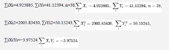
a. Find the formula of the line that best predicts population growth rate from mismatch. What is the trend in growth rate with timing mismatch?
b. What is the confidence interval for the slope of this line?
c. Are the data consistent with a “substantial” effect on population growth rate (where “substantial” refers to a decline of 0.1 or more in growth per 10-day mismatch, which would be enough to cause extinction with expected climate change)?
d. Is there a significant relationship between mismatch and growth rate of the population? Carry out a formal test.
Data from Example 2.3A
Is reproduction hazardous to health? If not, then it is difficult to explain why adults in many organisms seem to hold back on the number of offspring they raise in each attempt. Oppliger et al. (1996) investigated the impact of reproductive effort on the susceptibility to malaria in wild great tits (Parus major) breeding in nest boxes. They divided 65 nesting females into two treatment groups. In one group of 30 females, each bird had two eggs stolen from her nest, causing the female to lay an additional egg. The extra effort required might increase stress on these females. The remaining 35 females were left alone, establishing the control group. A blood sample was taken from each female 14 days after her eggs hatched to test for infection by avian malaria. The association between experimental treatment and the incidence of malaria is displayed in Table 2.3-1. This table is known as a contingency table, a frequency table for two (or more) categorical variables. It is called a contingency table because it shows how the frequencies of the categories in a response variable (the incidence of malaria, in this case) are contingent upon the value of an explanatory variable (the experimental
treatment group).
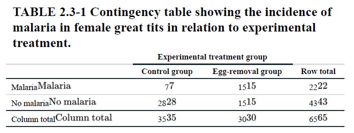
Each experimental unit (bird) is counted exactly once in the four main “cells” of Table 2.3-1, and so the total count (65) is the number of birds in the study. A cell is one combination of categories of the row and column variables in the table. The explanatory variable (experimental treatment) is displayed in the columns, whereas the response variable, the variable being predicted (incidence of malaria), is displayed in the rows. The frequency of subjects in each treatment group is given in the column totals, and the frequency of subjects with and without malaria is given in the row totals. According to Table 2.3-1, malaria was detected in 15 of the 30 birds subjected to egg removal, but in only 7 of the 35 control birds. This difference between treatments suggests that the stress of egg removal, or the effort involved in producing one extra egg, increases female susceptibility to avian malaria. Table 2.3-1 is an example of a 2×2 (“two-by-two”) contingency table, because it displays the frequency of occurrence of all combinations of two variables, each having exactly two categories. Larger contingency tables are possible if the variables have more than two categories. Two types of graphs work well for displaying the relationship between a pair of categorical variables. The grouped bar graph uses heights of rectangles to graph the frequency of occurrence of all combinations of two (or more) categorical variables. Figure 2.3-1 shows the grouped bar graph for the avian malaria experiments. Grouped bar graphs are like bar graphs for single variables, except that different category of the response variable (e.g., malaria and no malaria) are indicated by different colors or shades. Bars are grouped by the categories of the explanatory variable treatment (control and egg removal), so make sure that the spaces between bars from different groups are wider than the spaces between bars separating categories of the response variable. We can see from the grouped bar graph in Figure 2.3-1 that incidence of malaria is associated with treatment, because the relative heights of the bars for malaria and the bars for no malaria differ between treatments. Most birds in the control group had no malaria (the gold bar is much taller than the red bar), whereas in the experimental group, the frequency of subjects with and without malaria was equal. A mosaic plot is similar to a grouped bar plot except that bars within treatment groups are stacked on top of one another (Figure 2.3-2). Within a stack, bar area and height indicate the relative frequencies (i.e., the proportion) of the responses. This makes it easy to see the association between treatment and response variables: if an association is present in the data, then the vertical position at which the colors meet will differ between stacks. If no association is present, then the meeting point between the colors will be at the same vertical position between stacks. In Figure 2.3-2, for example, few individuals in the control group were infected with malaria, so the red bar (malaria) meets the gold bar (no malaria) at a higher vertical position than in the egg removal stack, where the incidence of malaria was greater.
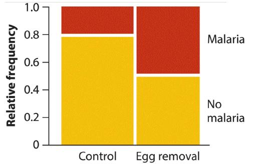
Another feature of the mosaic plot is that the width of each vertical stack is proportional to the number of observations in that group. In Figure 2.3- 2, the wider stack for the control group reflects the greater total number of individuals in this treatment (35) compared with the number in the egg removal treatment (30). As a result, the total area of each box is proportional to the relative frequency of that combination of variables in the whole data set. A mosaic plot provides only relative frequencies, not the absolute frequency of occurrence in each combination of variables. This might be considered a drawback, but keep in mind that the most important goal of graphs is to depict the pattern in the data rather than exact figures. Here, the pattern is the association between treatment and response variables: the difference in the relative frequencies of diseased birds in the two treatments. The mosaic plot uses the area of rectangles to display the relative frequency of occurrence of all combinations of two categorical variables. Of the three methods for presenting the same data—the contingency table, the mosaic plot, and the grouped bar graph—which is best? The answer depends on the circumstances, such as how different the frequencies are in the different categories, and it is a good idea to try all three. Choose the method that shows the pattern in the data most effectively. We find that association, or lack of association, is easier to see in a mosaic plot than in a grouped bar graph, but this will not always be the case.
Step by Step Answer:
a Linear regression formula and trend We will calculate the regression line using the formula Y abX where Y is the dependent variable population growth rate X is the independent variable timing mismat...View the full answer


The Analysis Of Biological Data
ISBN: 9781319226237
3rd Edition
Authors: Michael C. Whitlock, Dolph Schluter
